How I designed a dashboard that accidentally tripled the number of contributors on the AfroTada platform
The impact of AfroTada’s new dashboard
The dashboard unexpectedly tripled the number of contributors while achieving its primary goal of improving our article publishing workflow.
When we launched the new dashboard for AfroTada, our goal was simple: streamline our article publishing workflow. The old process was cumbersome. Our product team would manually collect articles sent via email, written in a word document, and then our developers would painstakingly code these articles into the website. This method was not only time-consuming but also inefficient.
The new dashboard was a game-changer. It was initially designed to save us countless hours of manual labor each week. However, its impact went beyond our expectations. To our surprise, it also led to a threefold increase in the number of contributors to our platform.
This outcome was unforeseen but certainly welcome. By simplifying the article submission process, we unknowingly made our platform more attractive to potential contributors. The ease of use encouraged more contributors to share their work, significantly growing our contributor. This experience taught us the power of a user-friendly process and its ability to not only improve operational efficiency but also to foster platform growth.
Spotlighting the team behind this project
As the lead product designer, I led the design process, collaborating with developers and other stakeholders to bring the project from concept to completion.
With my expertise as the lead product designer, I spearheaded the design effort. Through out the whole process I worked with cofounders Zainab Olaitan and Simotwo Zainabu. Olabayo Balogun and Adedayo Aturu dedicated their skills to development and engineering. This wonderful team ensured the project's success from concept to completion.
Transforming AfroTada’s workflow from static to dynamic publishing
We needed a dashboard to replace our inefficient, manual content management process with a semi-automated one.
The story started like this. AfroTada, an online publishing platform dedicated to showcasing African stories faced a significant challenge in its content management process. On the old website, before we did a UI and UX overhaul of the platform (case study here), and before this dashboard project, we were using a really inefficient method to populate content on the website. Contributors would send articles via email, and the engineering team had to manually code them onto the site. This method was time-consuming and created bottlenecks in communication and article management.
Recognising the need for improvement, we decided to embark on a project that could semi-automate the publishing process. This new system will be aimed at streamlining operations and enhancing efficiency by simplifying how content was managed and published.
Ideating and laying the foundation of this brilliant project
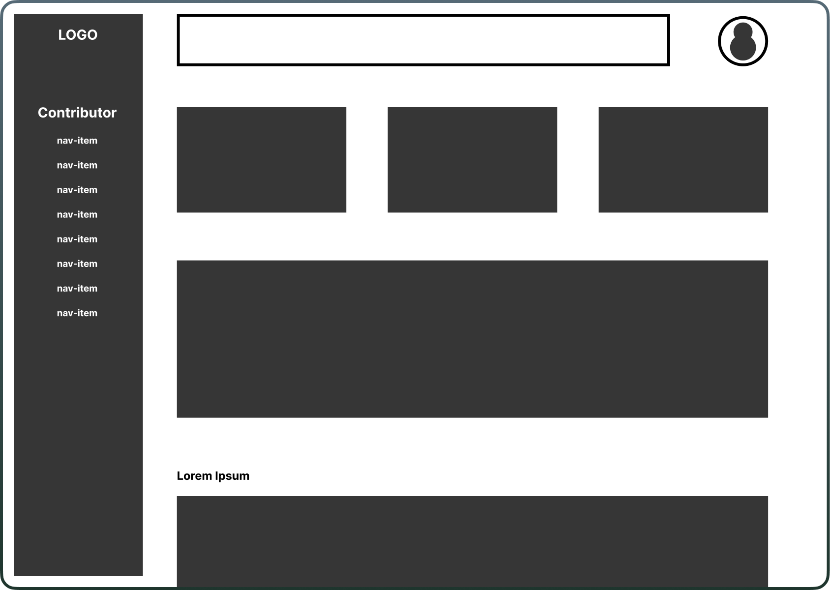
I started the project by brainstorming and wireframing, which led to the concept of three distinct dashboards for managing article publication on the AfroTada platform.
I began the project by brainstorming to clearly define what we aimed to achieve. We wanted an efficient way to manage how articles were published on the AfroTada platform, but the specifics were initially unclear. However, the idea of a dashboard quickly emerged as a solution.
To further develop this idea, I started digital wireframing, which led to three ideas for a dashboard, a contributor’s dashboard, an editor’s dashboard, and an admin dashboard. This brainstorming and wireframing approach allowed me to explore various facets of the project and refine our vision before committing to any high fidelity designs or development.
Crafting the finished product
I designed three high-fidelity dashboard mockups, using AfroTada's design language and UI kit to streamline the process.
After getting a clear picture of the solution I want to design. I transitioned to designing the high-fidelity mockups. Leveraging AfroTada’s newly established design language and our expanding UI Kit also significantly sped up the UI design process.
The design process resulted in the creation of three different dashboards.
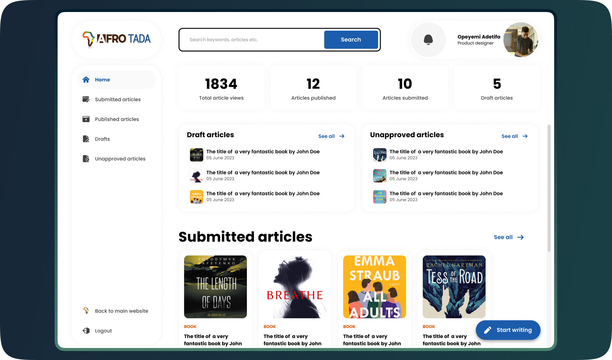
Firstly, there is the contributors dashboard which will allows contributors to write, submit, and manage their articles.

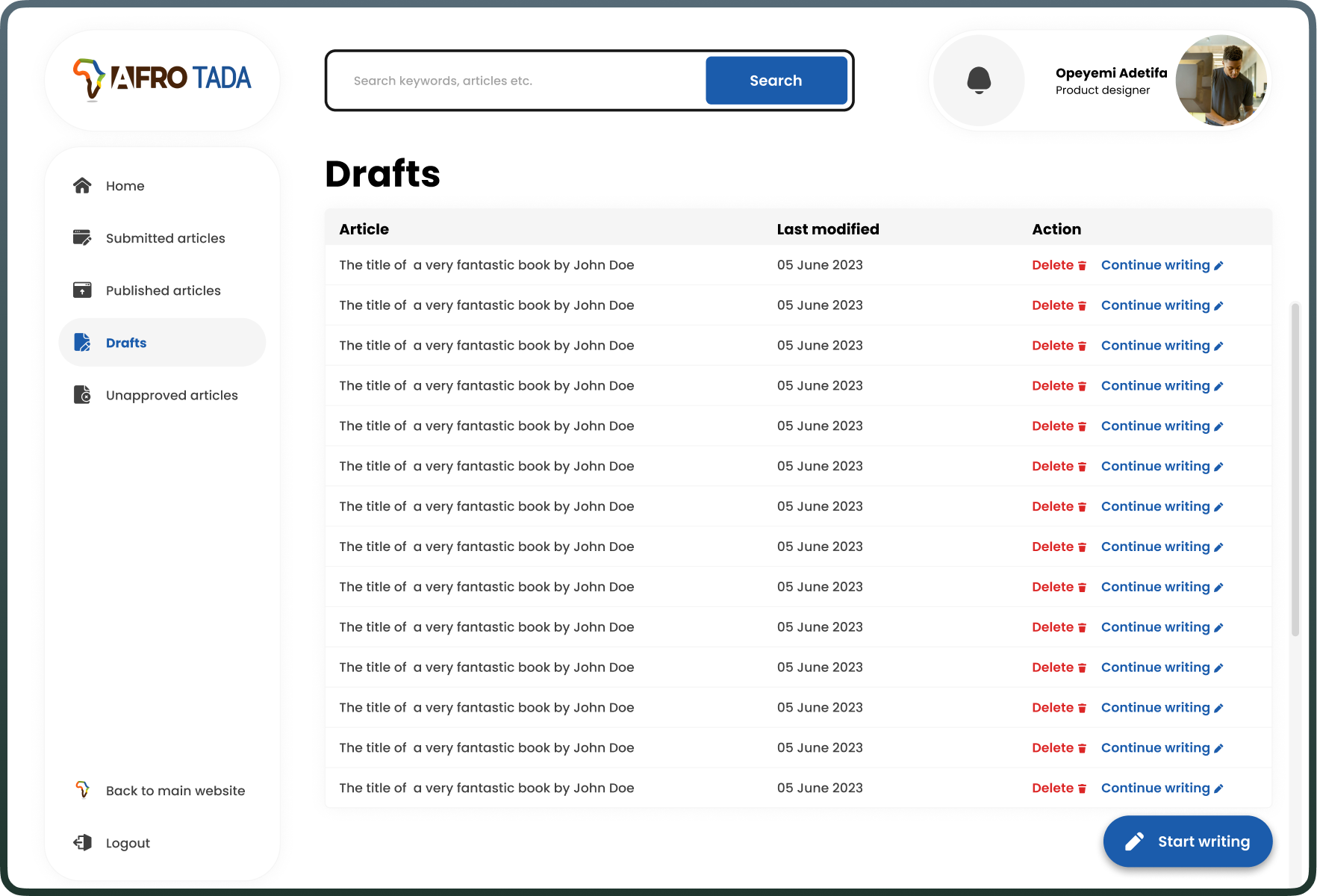
There’s also a draft section that allows contributors to save their articles to work on it later and a quick information section that provides a quick overview of key metrics to the contributors to help in monitoring their activity and engagement on their articles on the AfroTada platform.
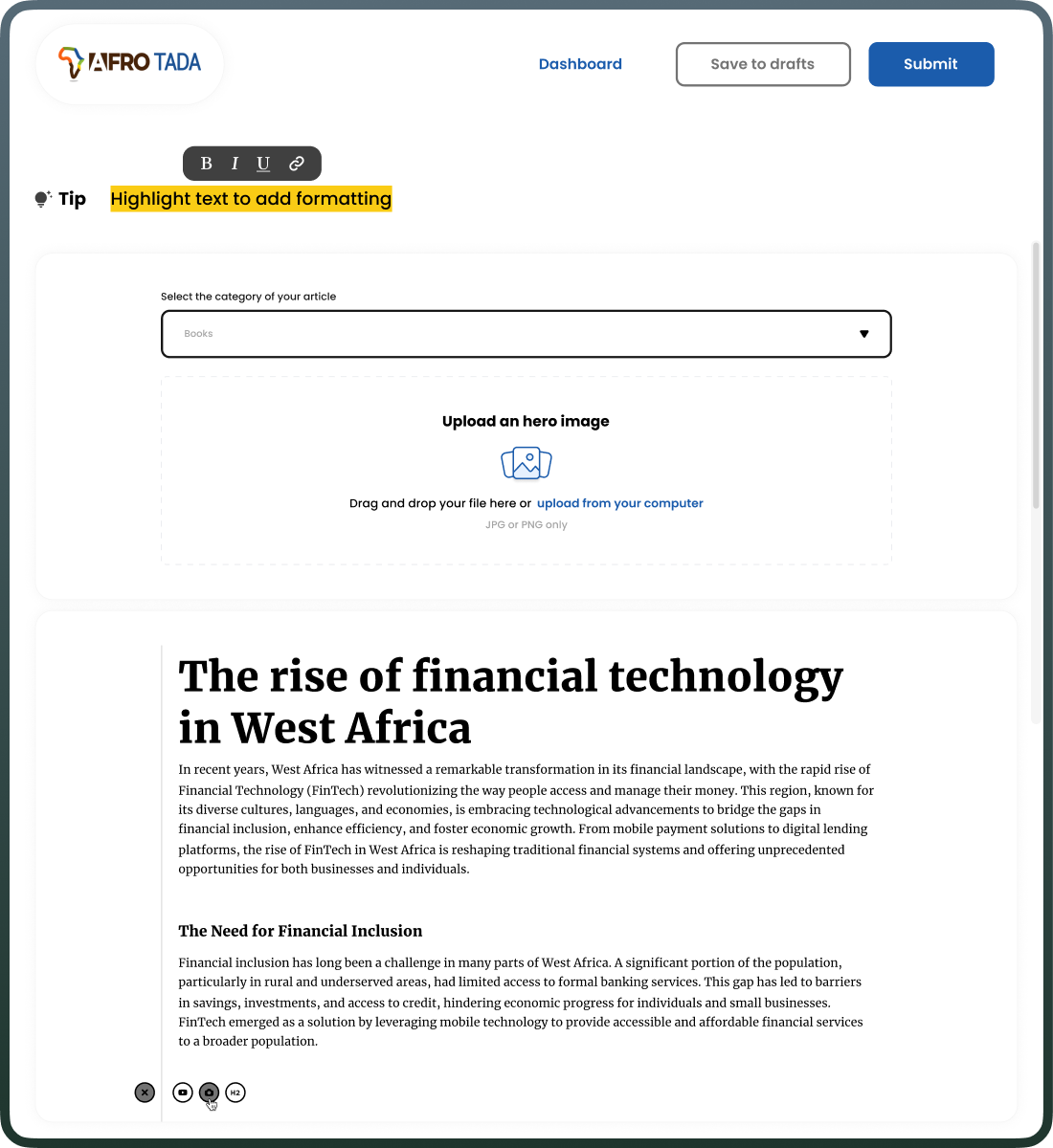
The dashboard features an built-in writing tool which allows user to write their articles directly on the platform. The built-in writing tool includes a dropdown that allows for content categorisation, a drag-and-drop or file upload interface for adding a main image to the article, a WYSIWYG (What You See Is What You Get) editor where the text is displayed as it will appear when published which allows users to visualise the final output while editing and a tip box at the top which advices the users on how to use the formatting tools.
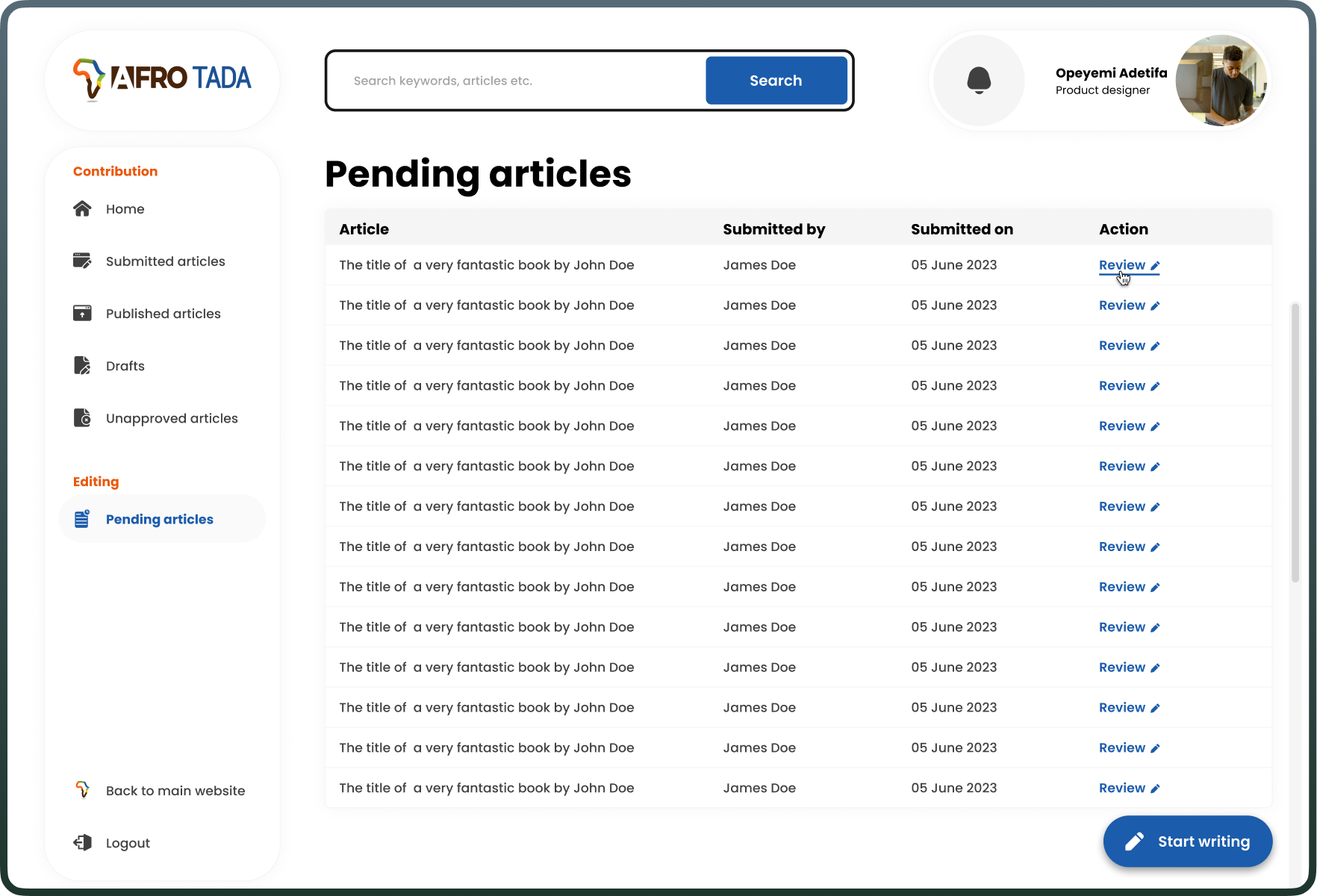
Secondly, the editors' dashboard builds upon the contributors' dashboard by adding editing and reviewing functionalities. Editors can manage, review, reject, or approve articles. Editors can access these submitted articles in the pending articles page which lists the articles in a table format for easy information scanning.
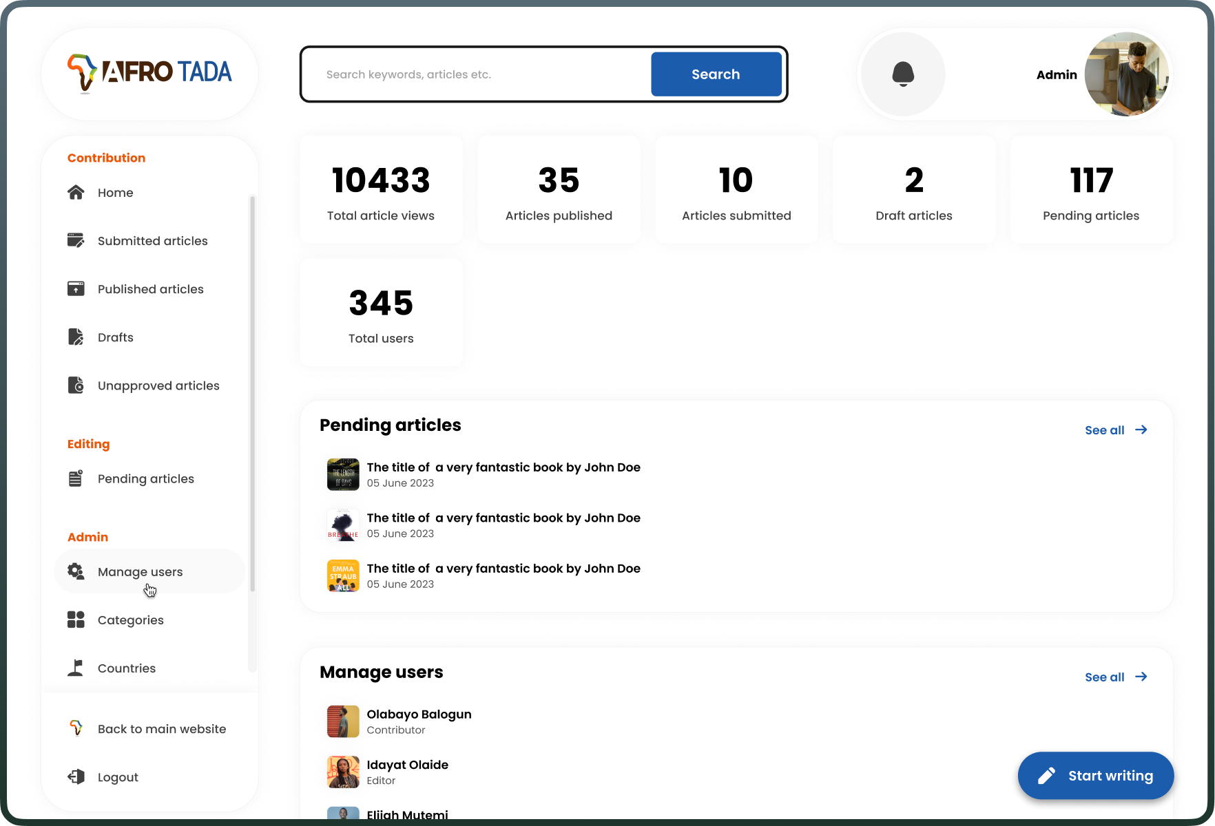
Lastly, the admin dashboard merges the editors' features with administrative tools for user, category, and platform settings management, such as country or region creation. This admin section present only on the admin dashboard, empowers backend task execution related to user management and content categorisation.
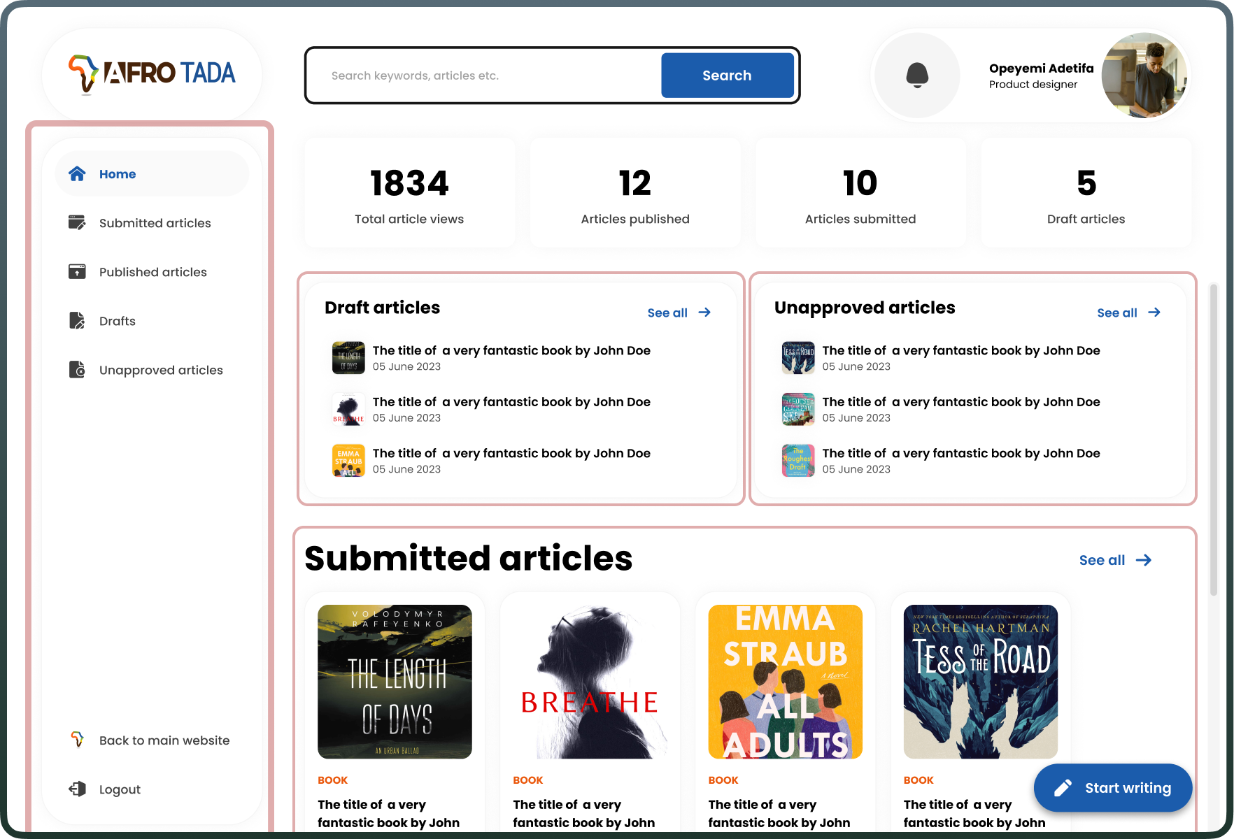
In all three dashboard I prioritised user navigation ease by implementing a straightforward left sidebar menu, which is a common pattern for dashboards, allowing users to easily move between different sections. In general, I focused on the progressive disclosure principle. I made sure the main view only provides a summary of the content status, with options to drill down for more details. This technique helps in managing the complexity and keeping the user focused on the most important data.
Getting user feedback
User testing of the dashboard was largely successful, but it uncovered a crucial missing feature for the admin to reassign articles.
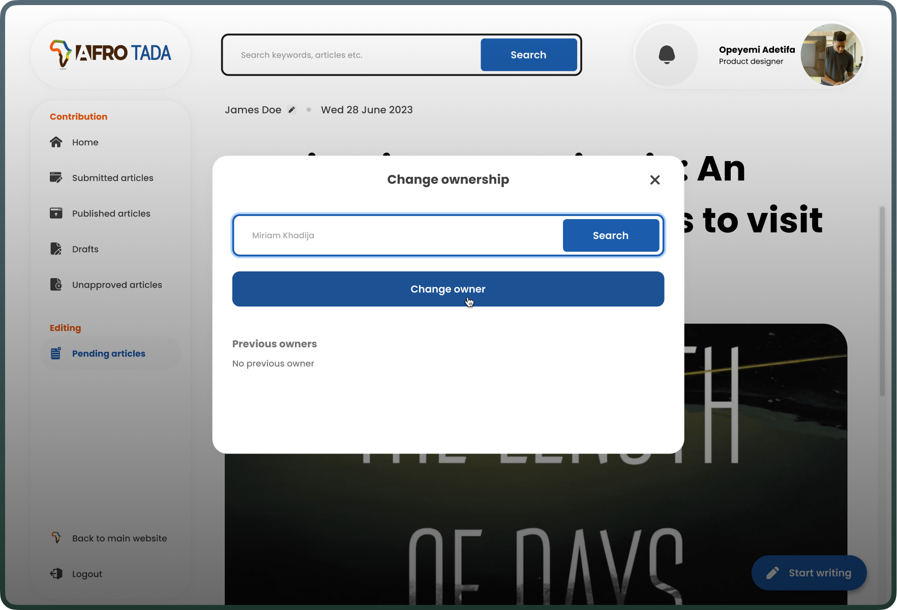
Before launch, I conducted a trial run of the dashboard with potential users, including contributors and the admin. The feedback was overwhelmingly positive, highlighting the efficiency gains and the convenience of saving drafts. However, the admin requested the ability to reassign articles to different authors. This was a feature we had overlooked but was crucial to the process. I then acted on the feedback and proceeded to design that feature.
To round up this beautiful story
The dashboard streamlined article submissions, boosting efficiency for our team and our contributors.
The dashboard, now live, represents a significant leap in efficiency and an improvement in overall user experience on the AfroTada platform. By addressing original pain point of our product and engineering teams where we manually receive articles by email from contributors and hardcode them on our website, we also improved the user experience for our contributors and tripled our contributor count in the process.
Lessons learned and next steps
This projects shows that unexpected improvements can come from trying to solve other pain points.
While solving one problem, we can sometimes serendipitously unlock doors we never knew existed. This is one huge lesson I learnt from this project, that and the importance of being open to new possibilities and being flexible in approach.
AfroTada is an ever evolving platform and we will continue to improve it based on feedback and innovative ideation.