AfroTada: African stories by Africans, for Africans
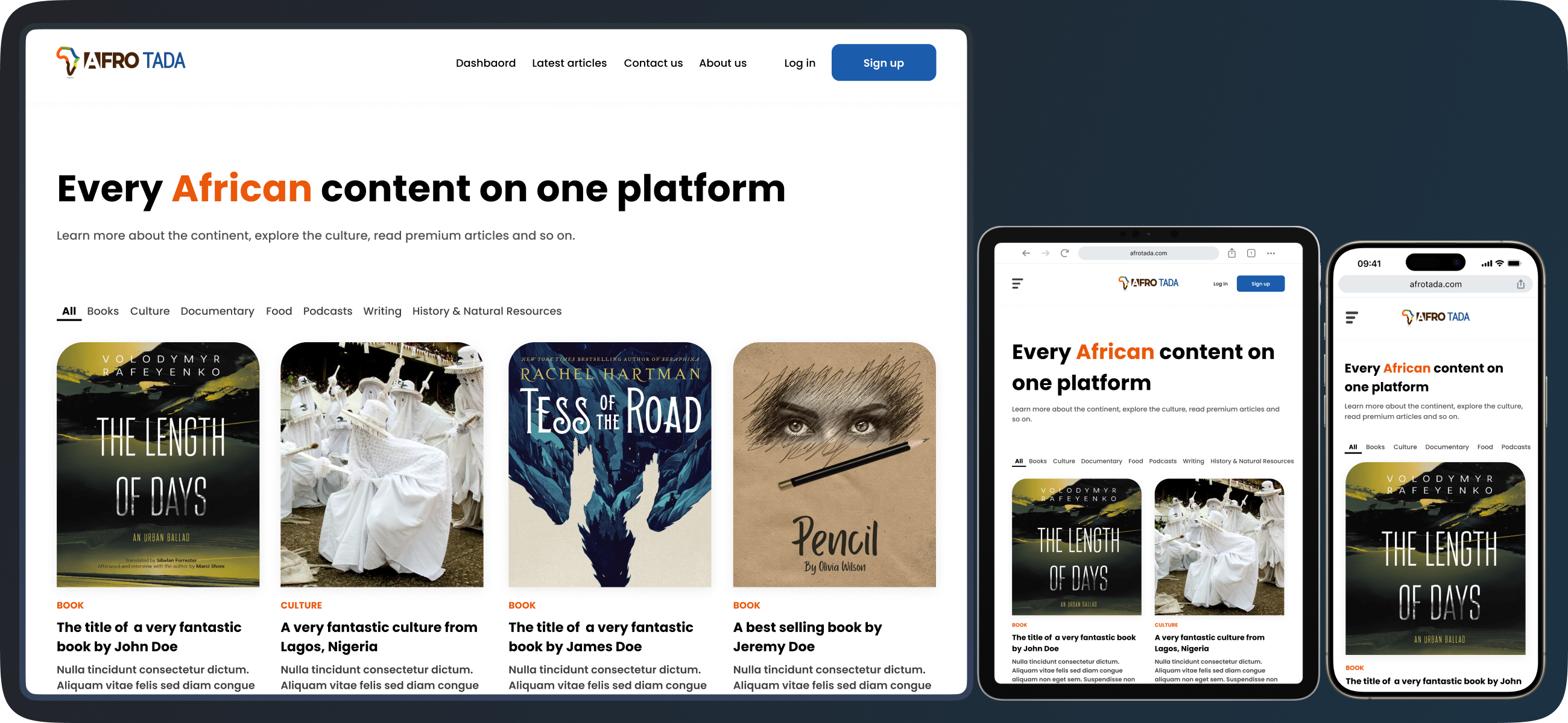
The impact of AfroTada’s redesign
The website redesign boosted visits by 65% in the first week and increased monthly visitors by 39% overall, thanks to the refreshed user interface.
The redesign of the AfroTada website was a tremendous achievement. The UI refresh generated new buzz for the website leading to a significant uptick in engagement. In the first week following the launch of the new website, visits surged by 65%, and we observed a 39% rise in the average number of monthly visitors in comparison to the previous version of the site.
What is AfroTada?
Afrotada is an online platform showcasing a variety of African-created content, including articles, literature, and art.
Afrotada is an online publishing platform dedicated to becoming a central hub for African narratives. Users and visitors can visit the platform to explore a rich collection of articles on a wide array of topics, ranging from literature penned by African authors to diverse forms of art and media crafted by Africans and so many other kinds of articles.
The guardians of AfroTada's new narrative
The redesign was a collaborative effort with the aim to enhance user experience while preserving the site's African-inspired visual identity.
The success behind the new AfroTada website was a team of dedicated professionals. I had the privilege of leading the redesign as the Lead Product Designer, but I also worked with Co-founders Zainab Olaitan and Simotwo Zainabu who supported this initiative when I pitched it. The technical side was handled by Lead Software Engineer Olabayo Balogun and Software Engineer Adedayo Aturu.
We wanetd to create a redesign that would retain elements of the old website's vibrant African aesthetic while improving user experience.
What is the need for a redesign?
The outdated website required a modern redesign and improved user experience with a focus on faster content access, responsive design, and addressing identified user pain points.
I started this project started with a comprehensive analysis of the old website. While the platform was functional and usability was not an issue, the lemon-green background and bright hues of the user interface (UI) began to feel outdated. There was a growing need for a fresher, more modern interface and experience.
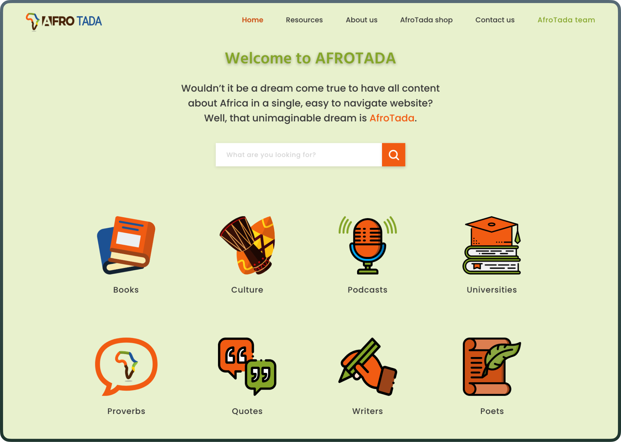
Asides from updating the interface, it was crucial to listen to our users and understand existing pain points. Through extensive research like usability testing and semi-structured user interviews, we discovered that users and visitors of the website wanted to be able to get to content faster without even leaving the homepage, we needed a UI and UX overhaul that would allow users to access content swiftly and without unnecessary navigation.
The existing website also lacked responsiveness across devices and this needed to be addressed.
Starting the blueprint (ideation)
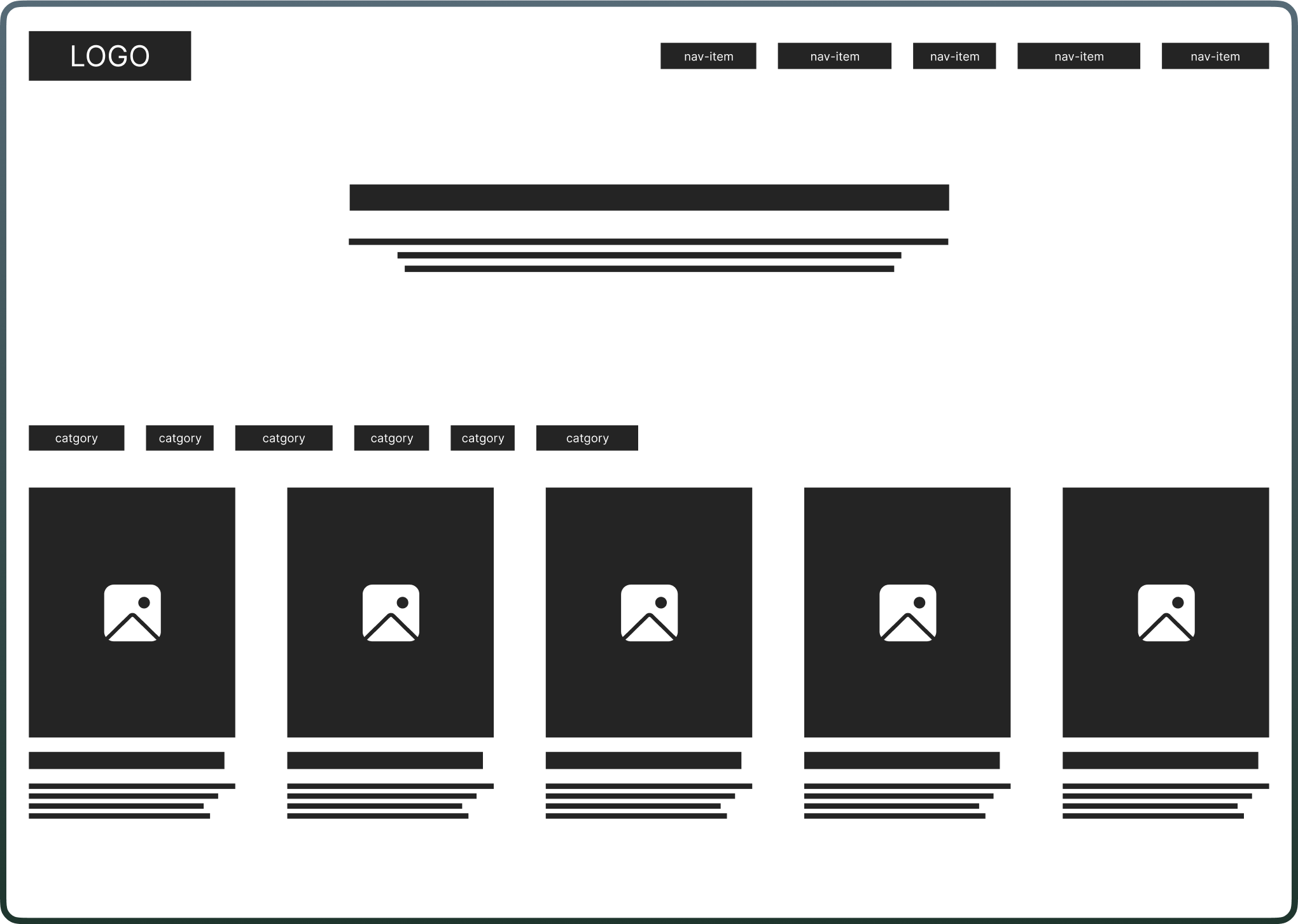
I started wireframes with the focus on a better layout and easier access to information.
With a clearly defined mission, we embarked on the redesign process. This began with the creation of digital wireframes to explore various layout options. Throughout this initial exploration, the goal was to create something that will improve content discoverability compared to the old website, allowing users to engage with content more effortlessly. These wireframes served as the groundwork for the design of high-fidelity mockups which followed.
Wireframes to high-fidelity: Painting the new AfroTada
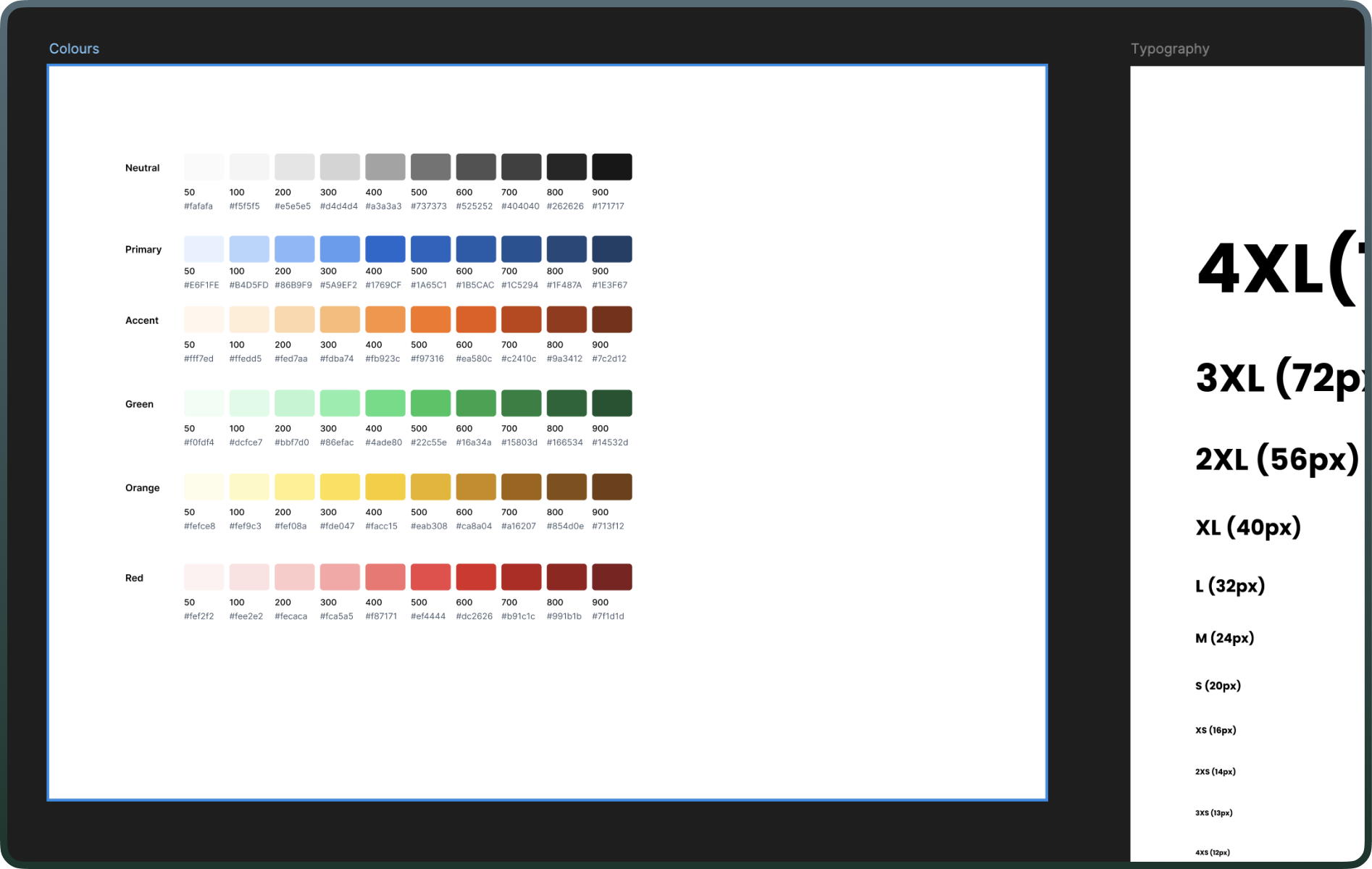
I created a UI Kit to ensure consistency and efficiency, then developed high-fidelity mockups that blended modern aesthetics with African-inspired colours.
Before diving fully into the high fidelity mockups, I meticulously created a UI Kit. This kit served as the foundation of the new interface, ensuring a consistent user experience across the platform and speeding up the UI design process. This kit was instrumental in creating a cohesive look and feel.
Armed with the UI Kit, I started working on the high fidelity mockups. I wanted to introduce a modern aesthetic while retaining some elements of the vibrant colours in the old website that echos the African heritage. Once the homepage was completed, the design of the remaining pages was completed swiftly as I was able to quickly reuse and even repurpose some components which sped up my UI design process.
Out with the old, in with the new
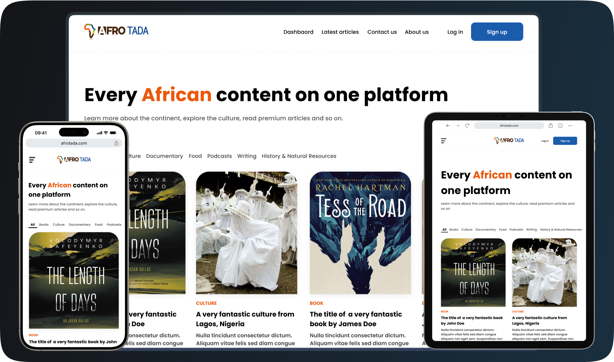
The new design enhances user experience through improved navigation, increased content visibility, responsive design, and an interactive African map.
I got rid of the old grid section that displayed the different content categories on the website. In its place, I introduced filters at the top, allowing users to effortlessly switch between categories of articles and content. This improvement significantly enhanced user navigation efficiency, enabling users to explore categories with a single click, a stark contrast to the previous design, which required returning to the homepage to view articles from another category.

I also populated the homepage with more articles on initial homepage loading unlike the old website where users could only see 3 articles. Now, users can discover more content directly from the homepage on initial load and can load additional articles by simply clicking the 'See more articles' button at the bottom, without the need to navigate away from the homepage.

Responsiveness was at the forefront of this new website. Desktop, tablet and mobile version were designed to inform the development of the website. The new designs were also crafted in a way that makes responsiveness intuitive while building and styling the website in code.
My personal favourite feature is the interactive African map. Users can hover over and click on any country on the map to learn more about it and access country-specific articles. This interactive element not only enriches the user experience but also educates visitors about the African continent in an engaging way.

Validating the vision through A/B testing
The A/B test comparing the old and redesigned websites showed a clear preference for the new design, validating the redesign's appeal to the target audience.
I carried out an A/B test to compare the old website with the redesigned version. I asked participants to explore the homepage, scroll and navigate through, and read articles on both versions of the site. After this activity, I asked them to choose which version of the website they preferred. The outcome was clear, 12 out of 15 participants preferred the new design. This strong preference across board for the redesigned website validated my designs and indicated that the new look would appeal more to our audience.
Inclusivity and accessibility considerations
I collaborated with developers to create an accessible website, keyboard navigation, and screen reader compatibility to ensure a user-friendly experience for all visitors.
Asides designing the website with accessibility in mind by focusing on things like colour contrasts and font sizes, I also worked alongside the dev team, we also ensured the site was navigable using keyboards and other input devices, and we incorporated semantic HTML to improve screen reader accessibility. Our efforts were aimed at making the website more user-friendly for everyone.
The result of this redesign process is an increase in average monthly visitors.
The redesigned AfroTada website saw a substantial boost in monthly visitors, peaking at a 69% increase in the first week.
The launch of the new AfroTada website led to a significant increase in average monthly visitors, with a notable 39% rise. This surge in visitors, particularly a peak of 69% in the first week, marked a considerable achievement. It highlighted the profound impact of my user-centred design approach, reflecting not only in the numbers but also in the deeper engagement users had with our content.
Next steps and the horizon beyond
The app, while facilitating quick connections between potential housemates, raises ethical concerns about possible discrimination.
Looking forward, We will continue to explore, design and build new features, we will continuously refine the user experience based on real-world use and user feedback.
One of the new features I’ve worked on and we’ve added so far is the contributors dashboard, a time saving and efficiency feature, you can read the case study here.