Designing TheeZign: A structured learning platform to help aspiring designers escape tutorial hell
The potential impact of TheeZign
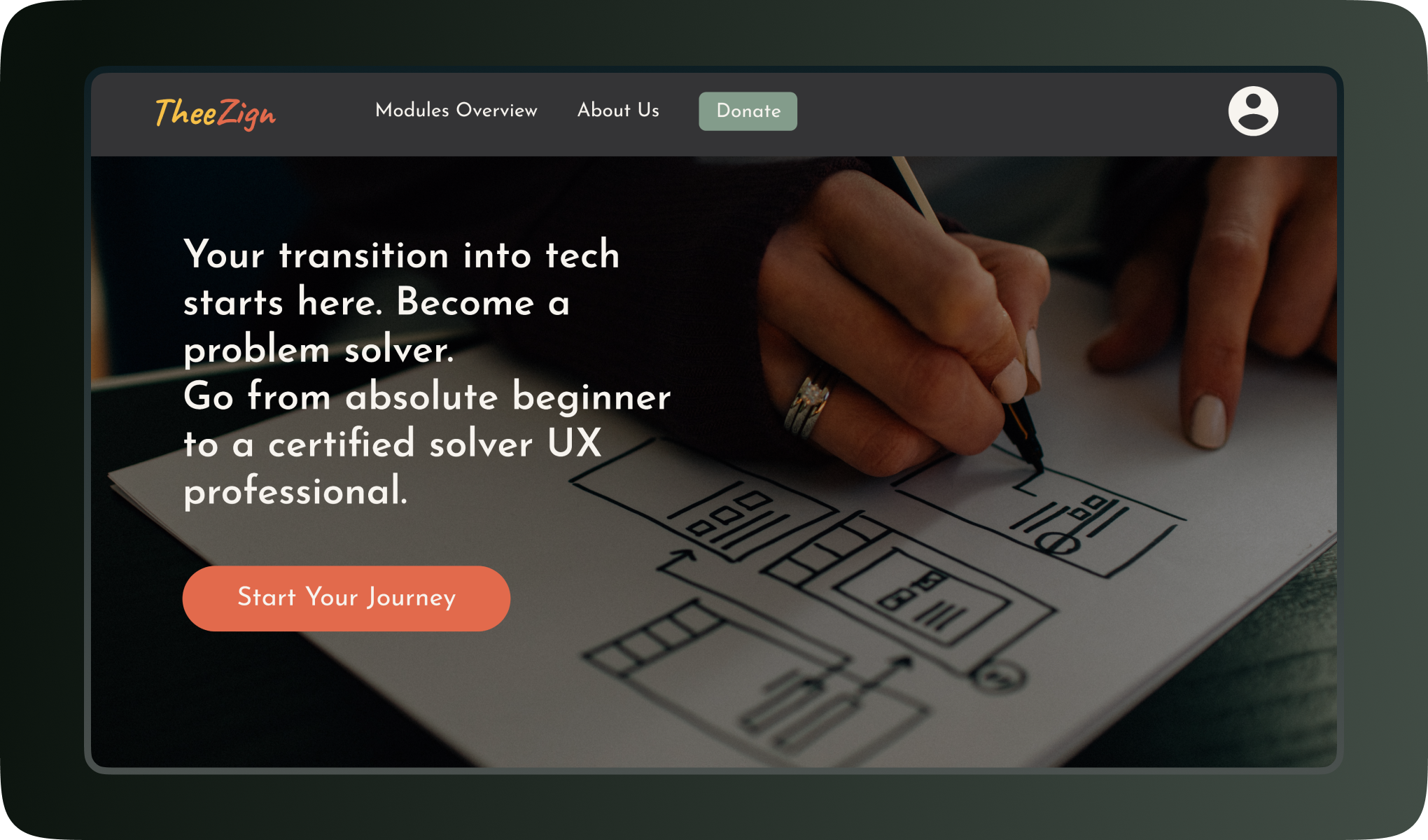
TheeZign is a learning platform that aims to provide a structured curriculum for mastering UX design, making the learning process more organised and enjoyable compared to self-learning.
TheeZign is a learning platform designed for individuals to help them master UX design without getting lost in the overwhelming sea of online tutorials. Unlike the unstructured nature of self-learning, TheeZign offers a meticulously organised curriculum similar to formal education. This structure not only streamlines the learning journey but also eliminates the cumbersome task of planning one’s educational path, making learning both effective and enjoyable.
Meet the team behind this project
I single-handedly handled the entire UX process.
As the project’s sole designer, I spearheaded the entire UX research process. My responsibilities ranged from conducting initial user interviews to gain insights into the learners' needs and preferences, to executing usability tests to polish the design. My role encompassed the entire visual design spectrum, starting with basic paper sketches, progressing to digital wireframing, and culminating in the creation of polished, high-fidelity screens.
Setting the stage: Why I worked on this project
Self-taught designers often struggle with fragmented online resources, so I wanted to work on a project aimed at improving learning experience.
Anyone who has entered into the design industry through self-learning understands the daunting experience of navigating through countless online tutorials and YouTube videos on UX design. This scattered approach often leads to frustration and, sadly, many abandon their journey into UX design. This was the driving force behind my involvement in this project aimed at social good.
Understanding the barriers to self-learning
The UX research revealed that aspiring designers struggle with information overload and lack of structure.
To understand into the obstacles faced by aspiring UX designers, I conducted generative UX research. This involved one-on-one semi-structured interviews, guided by questions designed to explore users’ needs, frustrations, and motivations. A common theme emerged: the absence of a structured learning path led many to give up their pursuit of UX design.
Through the research, I identified four main pain points:
- Overwhelming amounts of beginner-level information online, leaving many unsure of where to start.
- A clear lack of structured learning paths for self-learners.
- A strong desire for a curated and organised repository of essential information.
- The prohibitive cost of formal UX education.
Based on these insights, I crafted two personas that summarised the target users. These personas guided my decisions and ensured my solutions were firmly rooted in the real needs and challenges of those I aimed to help.
Analysing the current solutions out there
TheeZign aims to provide a more streamlined journey for UX design beginners compared to existing platforms, which can be overwhelming for newcomers despite their similar goals of helping people start careers in UX design.

CareerFoundry, General Assembly, UX Design Institute, Interaction Design Foundation, and YouTube are popular routes for those embarking on a UX design career. The first four are paid programs, with Interaction Design Foundation offering the most affordable option, although with a less structured curriculum compared to its counterparts. YouTube is completely free to self learn, but it’s also the least structured.
Their goals are similar, and they all aim to help beginners reach their career goals.
A potential area for enhancement across these platforms is the provision of a more streamlined and direct journey from absolute beginner to UX designer. Someone looking to transition when visiting these platforms for the first time might feel a bit overwhelmed with the different courses and modules on the homepage begging to be taken.
This insight will inform the homepage layout and design for TheeZign, as I aim to offer a clear and accessible pathway for beginners with limited UX design knowledge.
Brainstorming and laying the foundation of the website
The design process began with a sitemap and rough sketches, progressing through paper wireframes for various devices, and culminating in digital wireframes used to create a low-fidelity prototype for early feedback.
To design TheeZign (yes, that’s on purpose, lol), a desktop-first strategy was adopted because users, particularly those keen on learning design, would predominantly access the platform via desktop. This preference for desktops is due to their suitability for design tasks and learning activities.
The initial phase involved drafting a sitemap to outline the website's structure, serving as a blueprint for the subsequent design stages.

I then started working on different rough sketches to put the idea in motion.
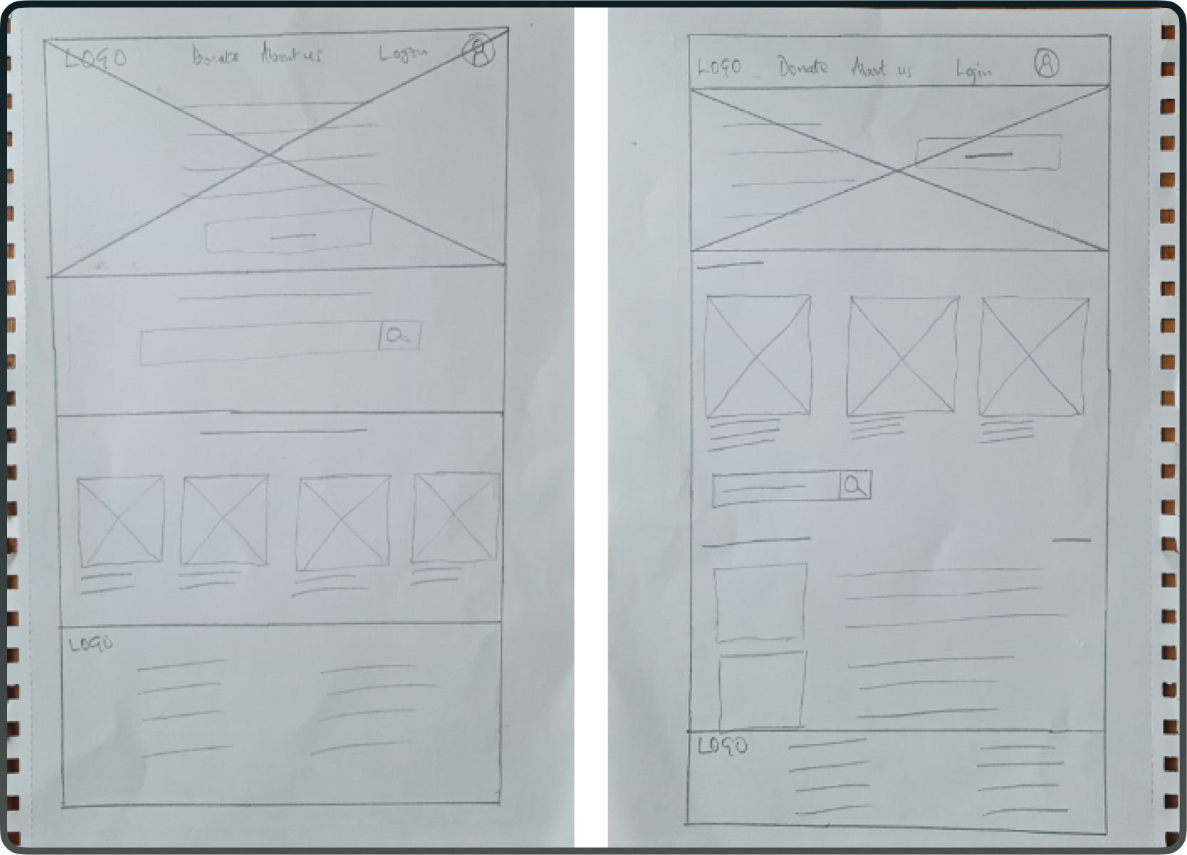
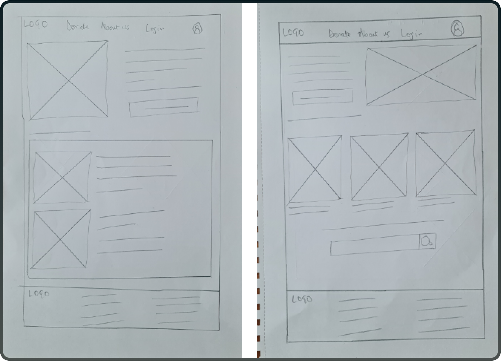
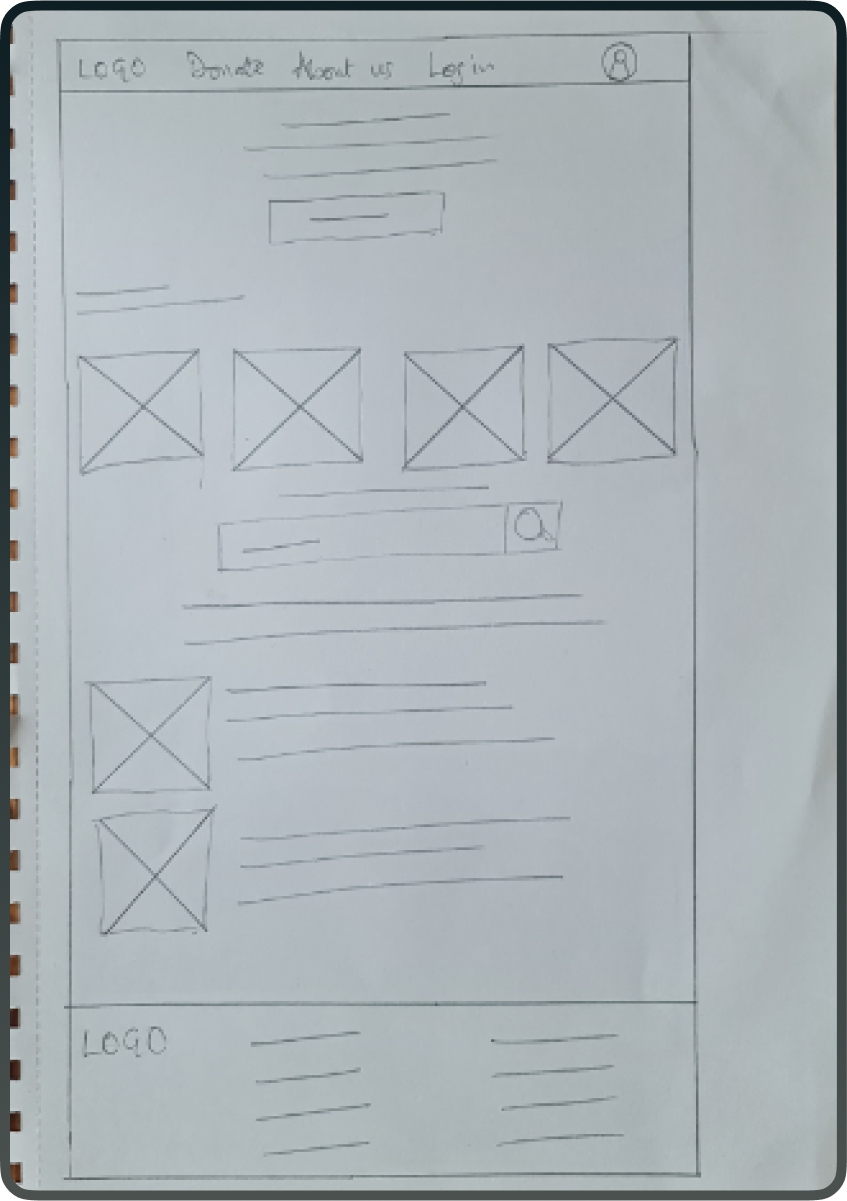
After that, I chose different elements from these sketches to make a single paper wireframe. One of the goals while drawing these sketches was to create clearly defined sections for easy information scanning on the homepage.
I also drew a rough sketch of the tablet and mobile sketches.
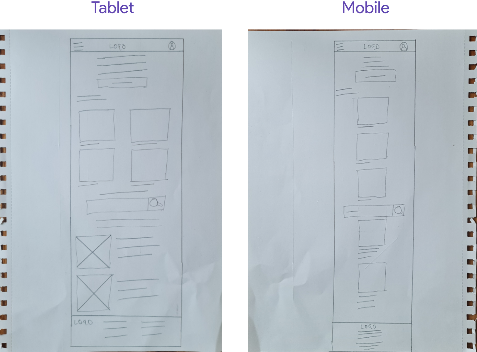
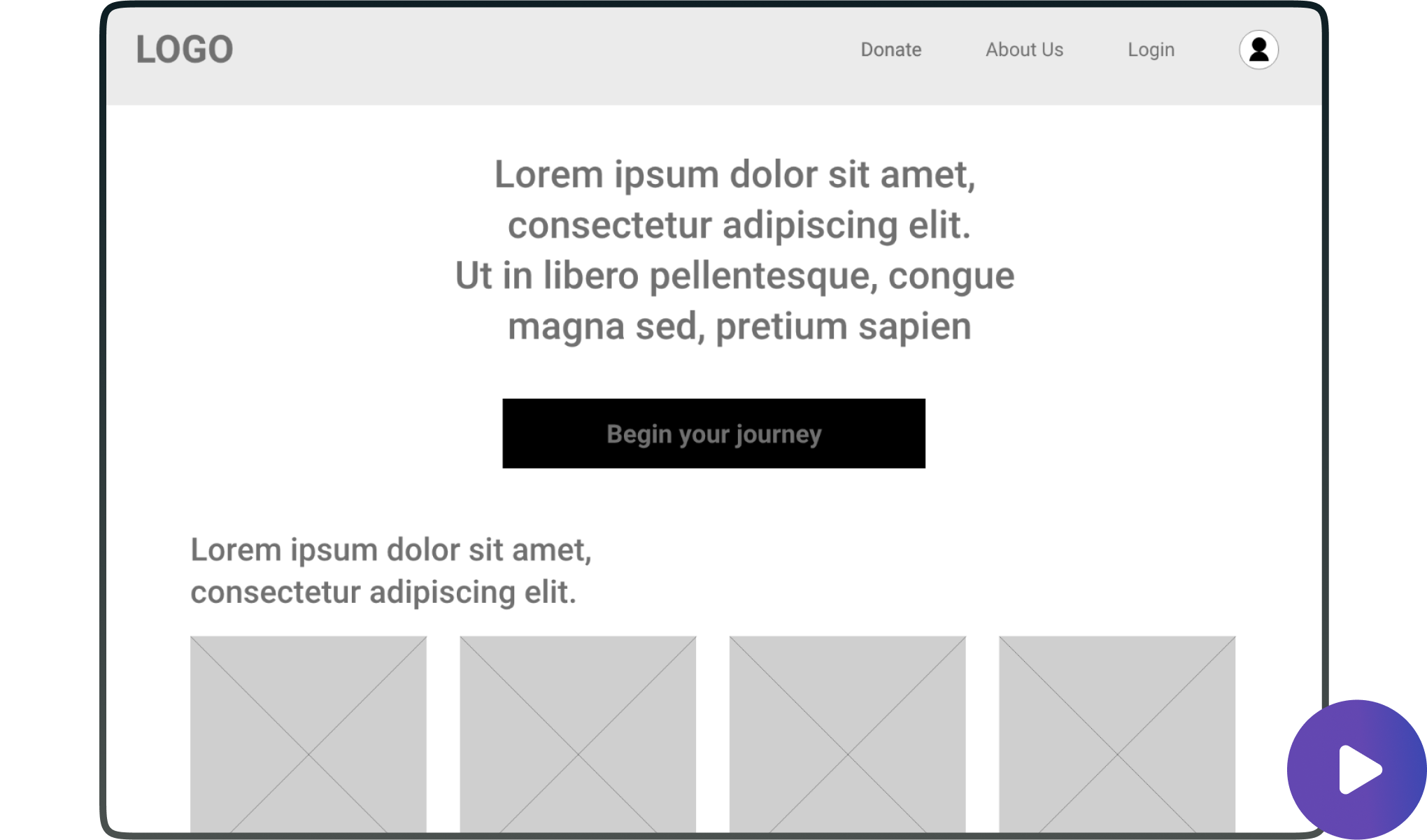
After working on the tablet and mobile sketches, I moved on to refining the ideas with digital wireframes which I then used to make a low fidelity prototype to get early feedback. Here's the low-fidelity prototype.
Testing with users
The usability study of the low-fidelity prototype revealed that while users easily started their first class, they desired additional features like class notes and module outcome previews.
I conducted a usability study with users using the low-fidelity prototype with two objectives in mind, assessing the ease with which users could initiate their first class and collecting qualitative feedback on their overall experience.
5 out of 5 participants had no difficulty with signing up and starting their first class. However, I got other insightful feedback with 4 out of 5 participants expressing their desire to be able to access notes and transcripts from the classes and 3 out of 5 participants wanting a way to know module outcomes before beginning each module.
Based on the usability study I designed the final mockups
The design was improved based on feedback from the usability testing with news features like module outcome and class notes added.
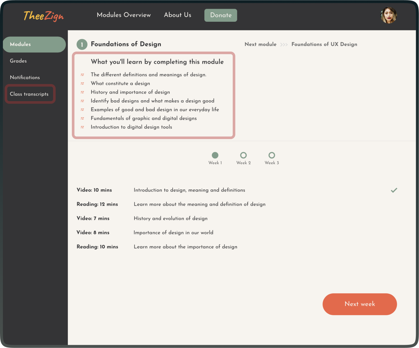
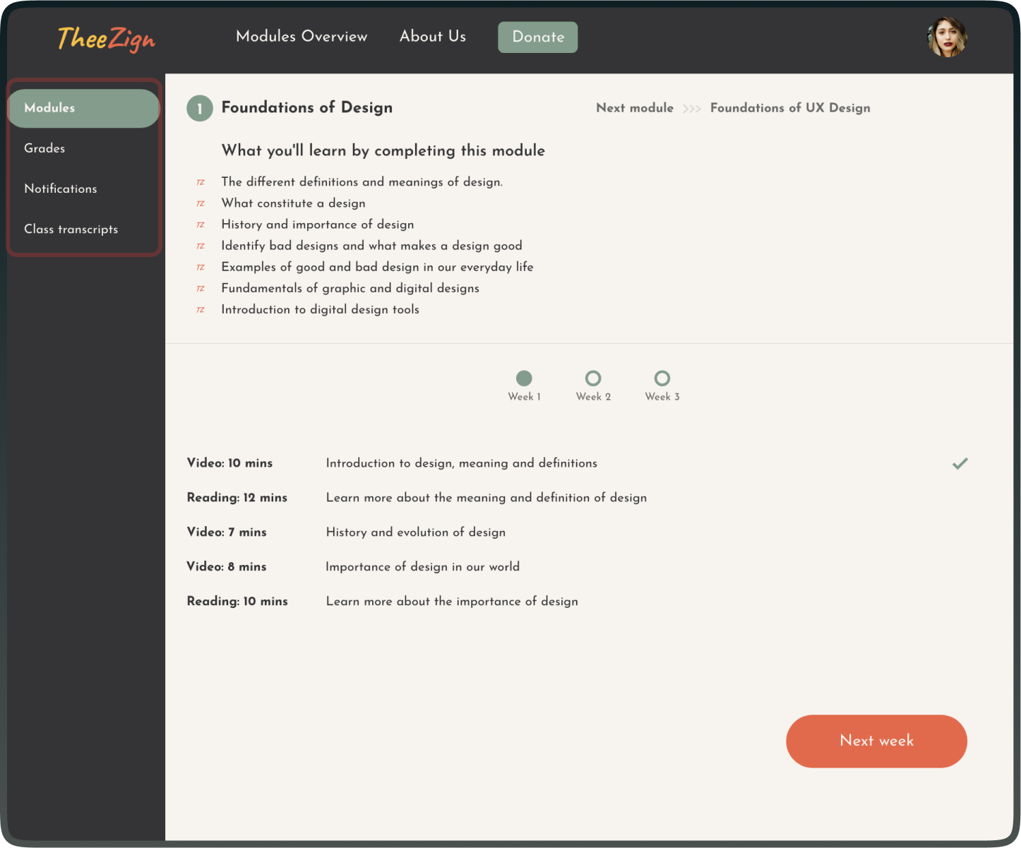
User can now know each lesson outcome. I added a section at the top that lists out what the users will learn by completing each modules.
I also added a class transcripts section on the side bar that contains transcripts of all the video lessons so that users get the option to go through the lessons by text if they choose to.
Simplifying the journey to being a UX professional
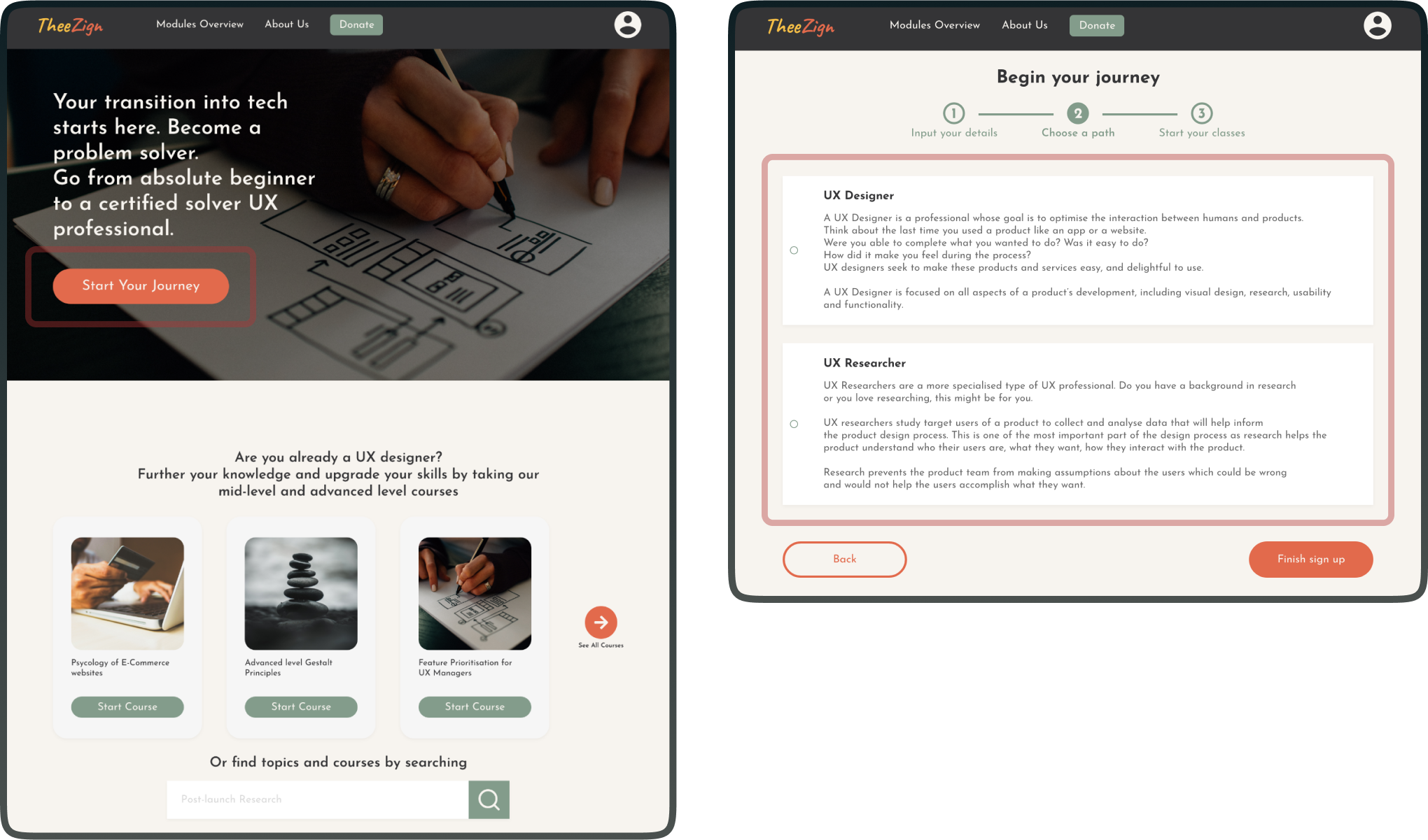
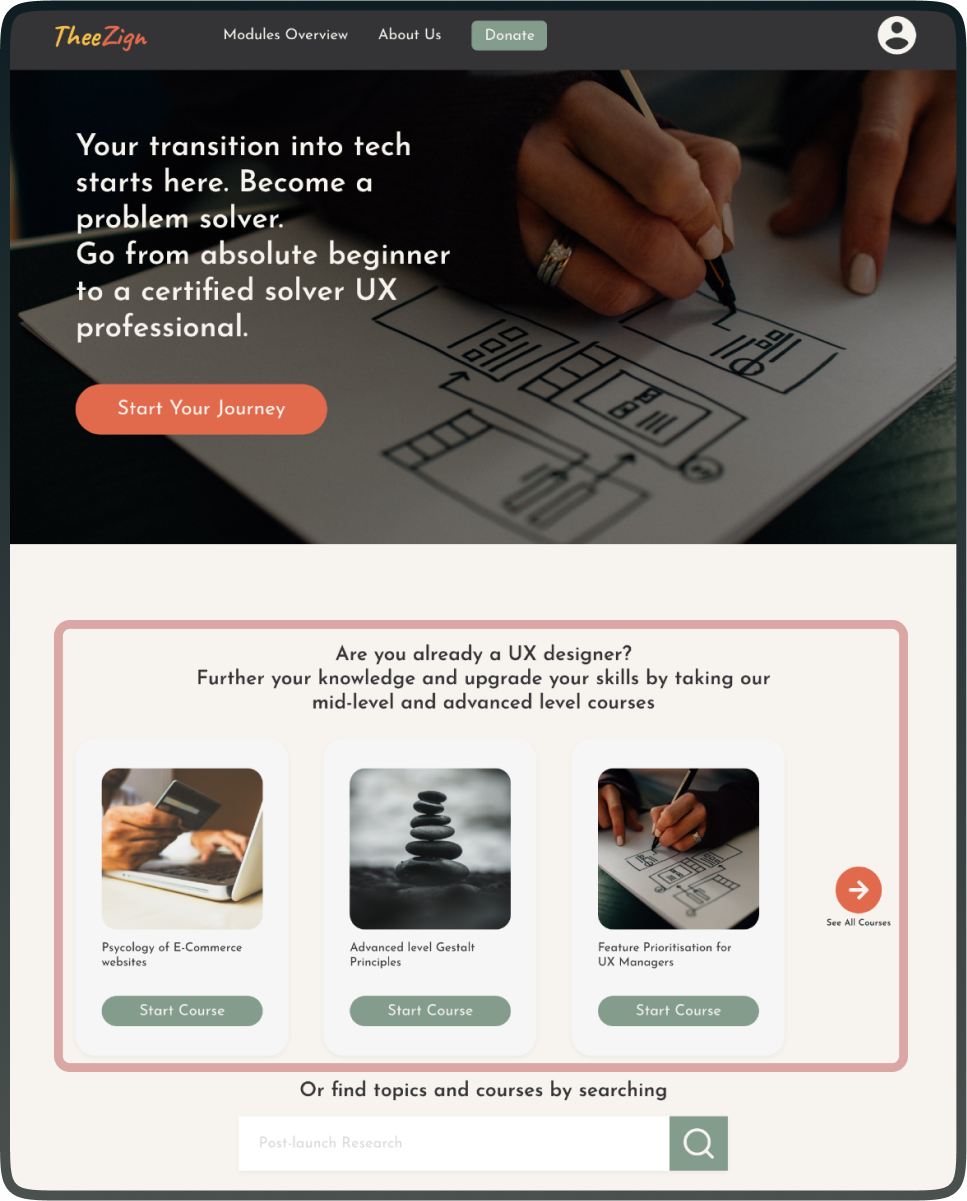
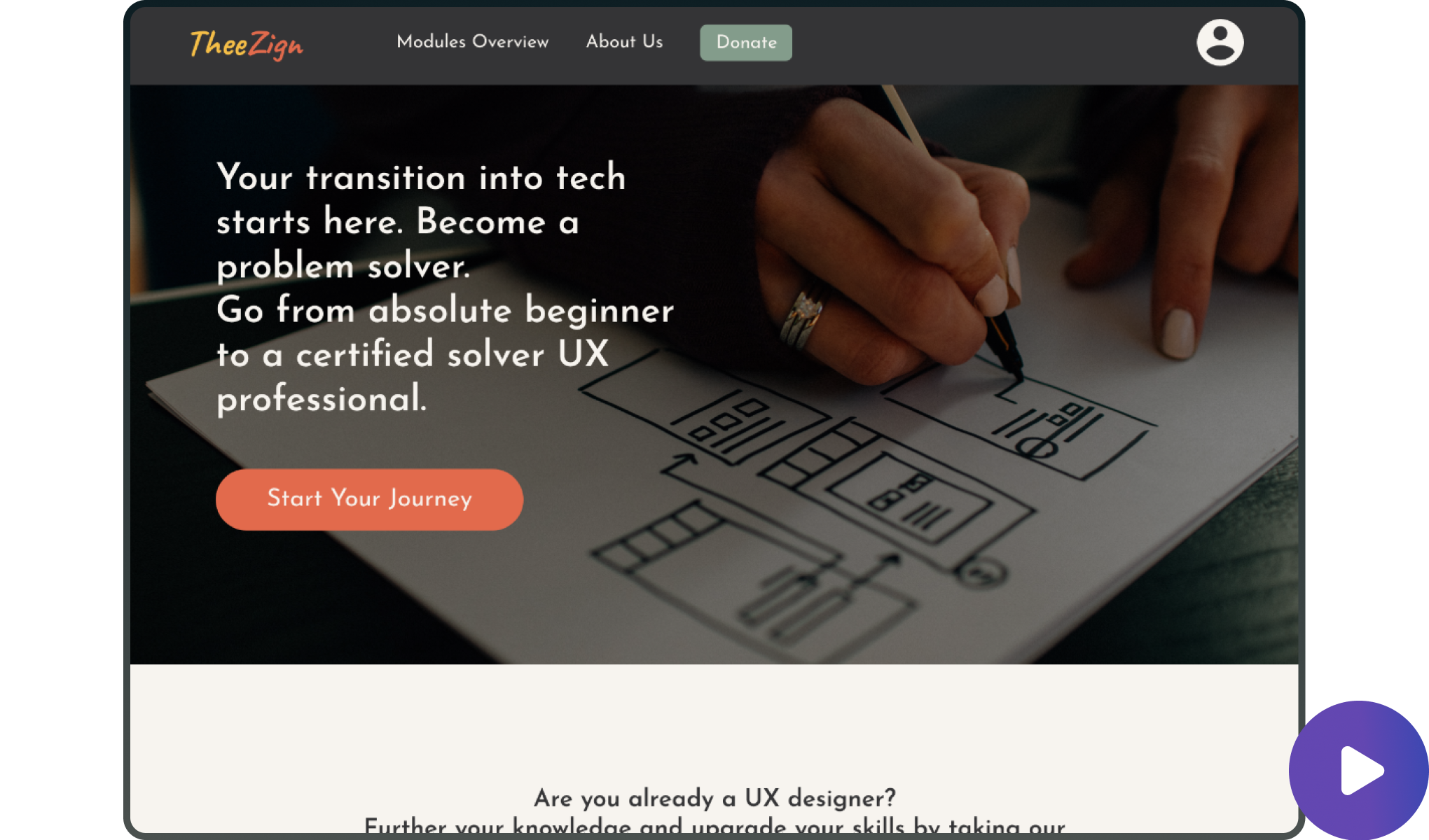
This platform makes it extremely easy to get started in the journey to be a UX designer. The "Start Your Journey" button is prominently displayed, providing a clear and straightforward next step for users interested in becoming UX professionals. The wizard style set up flow makes it incredibly easy to sign up. The step 2 in the set up flow provides clear choices of career path, UX Designer and UX Researcher, with clear explanations of of each choice. This make it easy to beginners to get started.
Serving mid-level to senior designers
The platform also provides an opportunity for senior designers to brush up on their skills and even learn new things with short courses clearly displayed on the page. The courses are presented with engaging visuals and concise titles, making it easy for users to understand what is available. Each course has a "Start Course" button, which is a good practice for direct action prompts.
Clear Navigation and Structure
The left-hand sidebar clearly labels sections such as "Modules," "Grades," "Notifications," and "Class transcripts," which provides easy navigation and access to important areas of the platform. This type of structured navigation is crucial for reducing cognitive load on learners.
A well organised content area
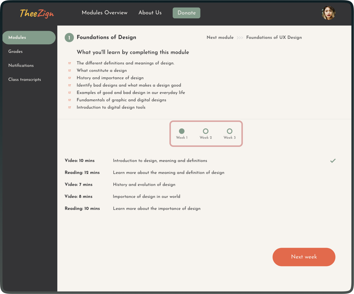
I made sure the main content area is well organised, with a module breakdown that includes video and reading durations, allowing learners to manage their time effectively. I acknowledge importance of structuring content logically and providing clear estimates of time commitment, which can help learners plan their study time.

I added progress tracking
The progress bar at the top of the lesson area indicates the current week the learner is on, with visual indicators for completed, current, and future weeks. This type of progress visualisation is beneficial for keeping students motivated and engaged by showing them their advancement through the course.
Here's the high fidelity prototype.
I focused on accessibility by making legibility and readability a core focus
I created a clean, accessible layout with thoughtful use of visual elements to enhance readability, while ensuring compliance with accessibility guidelines.
I made use of white space, clear fonts, a simple colour scheme and border lines to create a visually balanced design that aids in focusing on the content without feeling overwhelmed. I made sure to follow Web Content Accessibility Guidelines and that there is sufficient contrast between the text and background colours, which is important for users with visual impairments.
Going forward
I aim to create a free UX learning platform one day.
This project is personal to me because I know what it’s like trying to self learn. I hope one day I can pull resources together between myself and other designers to set up this free UX design learning platform.