Enhancing the e-commerce experience of Harvey Norman’s customers

The potential impact of the Harvey Norman app
The app streamlines the process of online shopping by offering detailed product information and realistic representations, saving customers time and eliminating the need for additional research.
This shopping app I designed for Harvey Norman introduces a flagship feature that enables users to thoroughly understand a product's functionality before making a purchase. This innovative approach eliminates the need for additional online research, streamlining the shopping process and making it more efficient. A participant from our usability study highlighted the impact of this feature, stating, "This is going to make my decision-making when buying items way faster."
Furthermore, the app addresses the needs of customers who are unable to visit physical stores because it offers a realistic visual representation of products, allowing users to see what items would look like in real life. This feature is particularly beneficial, as it removes the hassle of extensive internet searches to find product visuals.
Meet the team behind this project
I single-handedly handled the entire UX process.
As the sole designer on this project, I took charge of the entire UX research process, from conducting initial user interviews to understanding users' needs and preferences, as well as performing usability tests to refine the designs. I also handled the visual and UI design. My work spanned from preliminary paper sketches to digital wireframing, and finally, to crafting high-fidelity screens.
A quick background to set the stage
As part of my Google UX certification, I was tasked to design a shopping app.
I was tasked to design a shopping app in my Google UX professional certification. The app was for Harvey Norman Ireland, a retailer of tech gadgets, communications products, beddings, and furniture. Harvey Norman doesn’t have a mobile app and although they have a website, I needed to design an app that enhances the experience of users beyond what their current website offered.
Customers want an experience that’s close to physical shopping
I conducted interviews with retail customers to identify pain points in online shopping.
I started this project by talking to users, these are retail customers. I chose the sample size not just to represent Harvey Norman customers but to represent retail and e-commerce customers in general. Although, it’s an Harvey Norman shopping App I wanted to explore solving a problem that faces all e-commerce customers.
To gather insights, I conducted semi-structured interviews with individual participants. These interviews, guided by a set of questions, were designed to understand users' needs, frustrations, and motivations. Prior to the research, I presumed that customers preferred in-store shopping over online. The research confirmed this assumption and revealed further information that customers value the ability to physically interact with products, an experience that online shopping currently lacks.
Through the research, four main pain points emerged:
- Many users miss the realistic perspective offered by physical shopping, leading to a preference for in-store purchases.
- A significant number of users find most online shopping platforms unattractive and difficult to navigate.
- Concerns about online security deter some customers from making purchases.
- The need for extensive product comparison research is seen as a time-consuming task by many users.
Based on these findings, I developed two personas to guide the project's direction. These personas represent the diverse needs and challenges identified during the research, ensuring that the solutions devised are user-centric and address the core issues faced by online shoppers.
Scoping the competition
Harvey Norman can gain a competitive advantage in the Irish tech retail market by developing a user-friendly mobile app, addressing a gap left by competitors who lack strong mobile shopping experiences.

In the Irish technology and electronics retail market, key players include Currys, Three Ireland, and Fonez.
Currys is a prominent tech gadget and electronics retailer with a nationwide presence in physical stores and offers monthly payment plans. Three Ireland stands out as an internet service provider and communications provider, also dealing in tech gadgets. Fonez distinguishes itself by offering affordable and used devices, along with second-day delivery services.
Each competitor has its strengths. Currys and Three Ireland benefit from their extensive physical store networks and flexible payment options, catering to a wide range of customer needs. On the other hand, Fonez appeals to budget-conscious consumers by providing cost-effective options and quick delivery.
However, a common weakness across these competitors is the absence of a mobile shopping app or a subpar mobile shopping experience. In today’s digital age, the convenience of mobile shopping is crucial. Harvey Norman can capitalise on this gap by developing a user-friendly mobile app, enhancing the overall customer experience and gaining a competitive edge in the market.
With the insights from all the research I’ve done I started the exploring solutions
I conceived the idea to integrated video content in the app to streamline product research and improve the shopping experience.
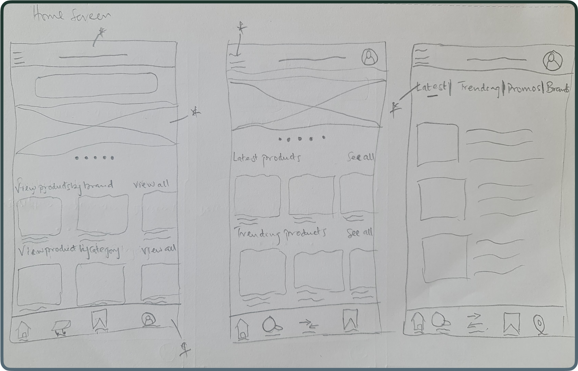
After all the initial research and competitive analysis, I began exploring potential solutions, starting with paper sketches. One of my objectives was to make navigating the the app simple, ensuring a seamless and uncluttered user experience. I did this by organising the homepage content into distinct tabs so that users can effortlessly locate the information they need.


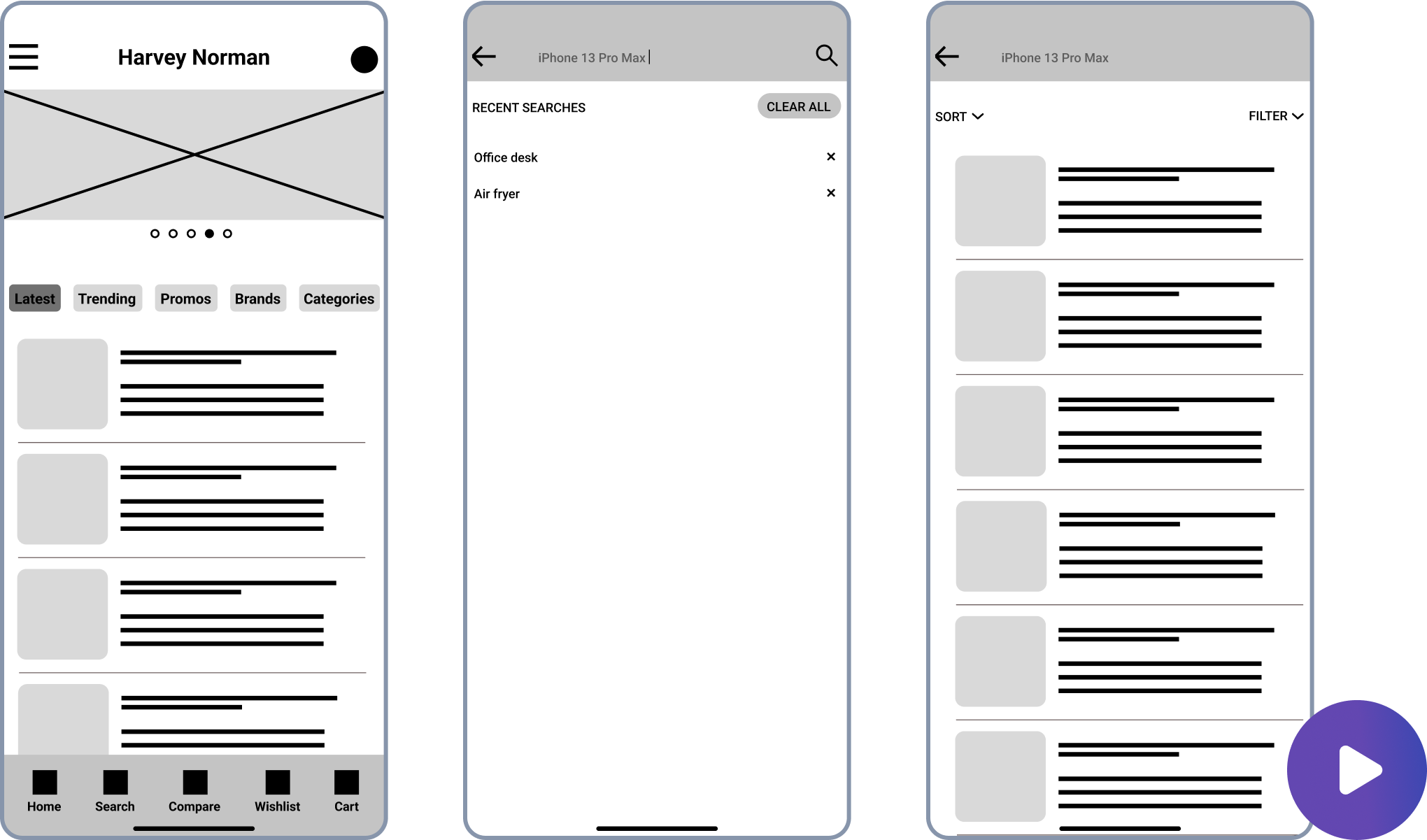
I then transitioned to digital wireframes to further refine my ideas. The addition of 'description', 'specification', and 'reviews' tabs on product pages was strategic to simplify navigation within the app.

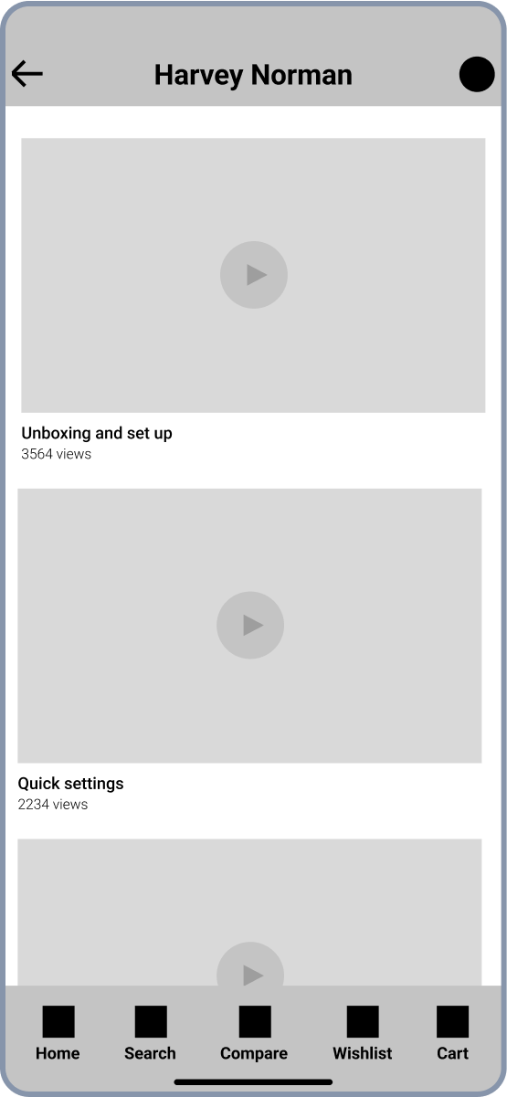
The flagship feature is a video content screen, allowing users to watch unboxing videos, first impression videos, and long-term reviews of products. This integration negates the need for external searches, thus accelerating the decision-making process and enhancing the overall shopping experience.

Validating my early work, is the flagship feature easy to find?
The usability testing revealed positive results for the checkout process but highlighted issues with navigation clarity in the checkout process.
Next, I focused on validating the accessibility of the key feature: the real-life video watching capability. Through a usability test, I assessed how easily users could locate and utilise the flagship feature, assessed its perceived usefulness, and assessed their comfort with the checkout process.
Here’s the prototype used in the usability test.

The findings were promising, with 4 out of 5 participants having no difficulty in finding the video watching feature and 5 out of 5 participants finding the video watching feature useful. Although 3 out of 5 participants had complaints about the lack of ability to add a new address or payment information in the checkout process.
Addressing the feedback, I improved the digital wireframes into high-fidelity screens and also incorporated the ability to add new address and payment details.
Here’s the high fidelity prototype.

Another round of usability testing yielded valuable insights, as 3 out of 5 participants said they cannot differentiate the bottom navigation from the rest of the screen. 3 out of 5 participants felt uneasy because they cannot identify where they are in the checkout flow.
Crafting the final solution
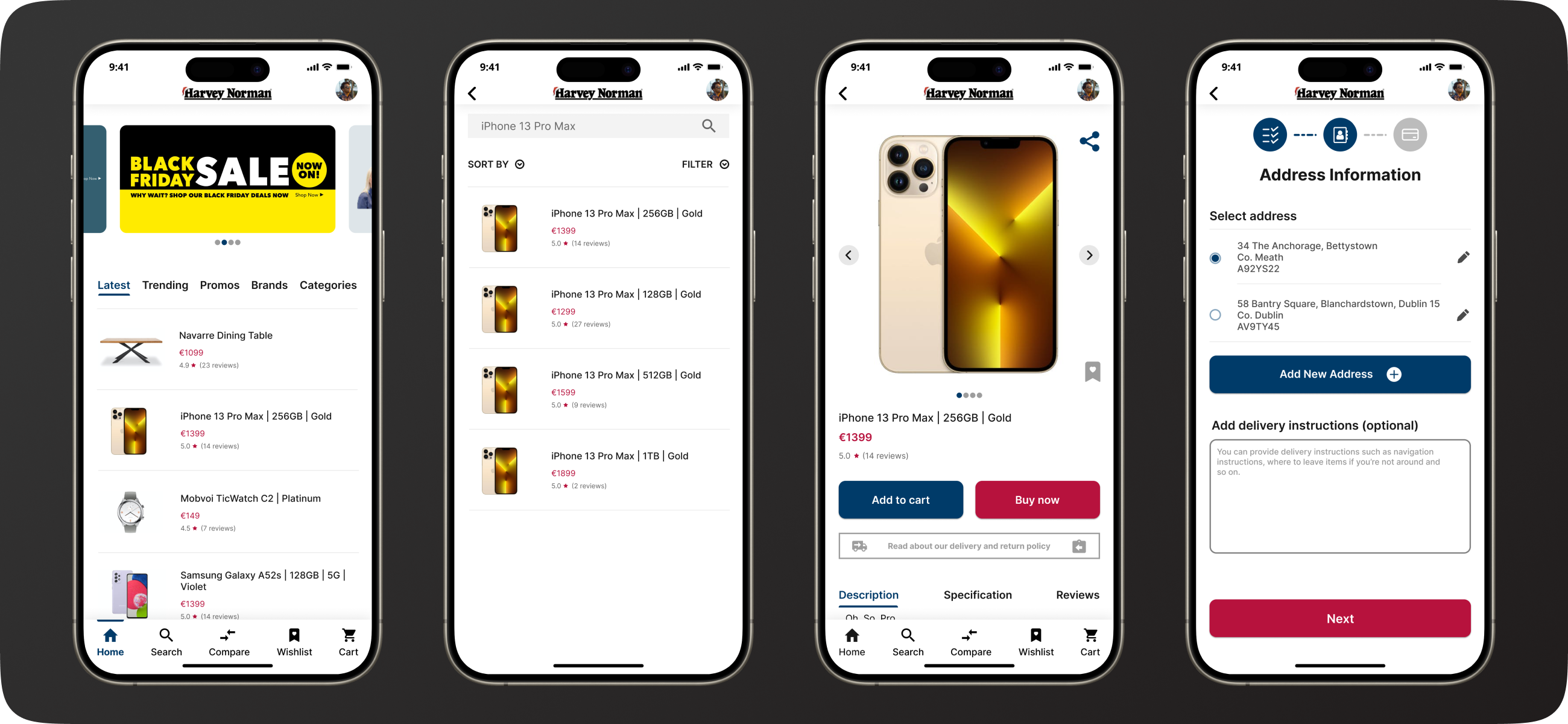
I refined some of the app's visual elements and added a checkout progress indicator based on usability studies and feedback, improving overall user experience and navigation clarity.
Based on insights from the second usability study and feedback received during the Google UX Design certification program, I made several improvements to the final mock-ups.
I introduced subtle shadows to the top bar and the bottom navigation bars, enhancing their separation from the rest of the screens for a clearer visual hierarchy. I darkened the border lines between items to improve distinction between them while preserving the aesthetic of the app.

Additionally, I implemented a checkout progress indicator at the top of the checkout screens, providing users with a clear understanding of their position within the checkout process.

How this app makes the lives of customers easier
The app's "watch real-life videos" feature improves the shopping experience by allowing customers to see products in real-life settings and understand how they work, making online shopping quicker and more enjoyable.
The app's flagship feature, “watch real-life videos”, significantly enhances customers’ shopping experience in two key ways. Firstly, it enables customers who are unable to visit stores physically to view products in real-life settings before making a purchase, eliminating the need for extensive internet searches. Secondly, it provides insightful information on how products work directly within the app, streamlining the online shopping experience and making it both faster and more enjoyable for customers.
Important accessibility considerations I made
The app prioritises accessibility and user-friendliness, featuring high-contrast elements, subtle shadows for improved visibility, and a unique video feature to assist shoppers with mobility challenges.
In developing the designs, I ensured that all contrasting elements adhered to the Web Content Accessibility Guidelines, achieving AAA accessibility. This was crucial to make texts and buttons on the screens easily readable.
To further improve visibility, I incorporated subtle shadows across the user interface, particularly on elements like buttons. This also included adding shadows to both the top bar and the bottom navigation bar, helping to distinctly separate them from the main content.
The app features a "real-life usage" videos feature, specifically designed to aid individuals with mobility challenges in shopping effortlessly. This functionality offers users a realistic view of products, enabling them to confidently make purchases from the comfort of their homes.
What I learned during this project
People prefer solutions that simplify their tasks, and I will use this insight in future design and tech projects.
One of the things that stuck with me during this project is that people would like to do less work to finish a task or complete an objective. People will gravitate towards something that makes their life easier. This insight is something I plan to carry forward into future design and technology projects, as well as apply in various other contexts.
Next steps
The project is in the prototype stage, and I hope to partner with e-commerce platforms like Harvey Norman to implement it one day.
Currently, the project is in its prototype stage. My aspiration is to collaborate with Harvey Norman or similar e-commerce platforms to bring this concept to fruition. Additionally, I am exploring the integration of augmented reality into the app. This feature would be particularly beneficial for furniture shopping, allowing customers to visualise how the products would fit into their own spaces, thereby enhancing the realism of the shopping experience.