Redesigning Kargo’s Creative Hub
Impact of the redesign
Creative Hub is Kargo’s central workspace for storing, browsing, and managing creative assets and ads. My redesign focused on clarifying content structure, leading to a 62% drop in support tickets and a 93% preference rate in A/B testing.
Creative Hub is Kargo’s central creative workspace. It’s where teams store, browse, and act on creative assets and ads. When I joined the project, it was already live as an MVP, but there were clear UX issues. The landing page felt crowded, the hierarchy was unclear, and users often had trouble telling folders, assets, and ads apart.
I redesigned the main pages, including the landing page, Ad Library, Asset Library, and the ad and asset detail views. The focus was on simplifying the experience, creating a clear and consistent structure for content, and improving self-serve usability for both internal and external creative teams.
The redesign resulted in a clearer separation between folders, albums, assets, and ads, predictable paths to the tasks users needed to complete, and a structure that scales for future features. These changes made Creative Hub easier to scan, easier to use, and more reliable for self-serve users, as reflected in a 62% drop in support tickets 2 months after launch and a 93% preference rate in A/B testing.
Let’s start from the beginning
Creative Hub was originally built quickly before design involvement. The MVP suffered from information overload on the landing page and poor visual treatment of different entities such as folders, albums, ads, and assets.
When I joined the project, Creative Hub already existed in production as an MVP. The development moved fast and design involvement came late, so the product needed UX hardening before the next general release in 4 weeks.
The MVP showed several usability gaps like confusing navigation, unclear treatment of different elements like folders, albums, ads and assets.
Given the tight time constraints (2 weeks for design, 2 weeks for development). I decided I would focus on a small set of near-term, high-impact fixes.
Highlighting the team that worked on this
I led the design work, partnering closely with Product to define direction and working with Engineering to deliver the redesign from concept to implementation.
As the lead designer on this project, I owned the redesign of Creative Hub from early direction through to final designs. I worked closely with Helen Fulkes (Senior Product Manager) to define scope, align on priorities, and ensure the work addressed both immediate product needs and longer-term goals.
On the engineering side, I collaborated with Wade Hampton, Jenna Hu, Pranava Udayagiri, and Timmy Morrissey to bring the designs to life, working through constraints, refining interactions, and ensuring the final implementation stayed consistent with the intended user experience.
Casey Gordon (Lead Product Manager) also played a role in shaping the overall product direction and ensuring alignment with broader platform priorities.
Designing the solution
I started with a UX review of the existing MVP to identify core usability gaps, then iterated on solutions across key screens, including the landing page, ad and asset libraries, and ad and asset detail pages. With each iteration, I focused on simplifying structure and improving clarity.
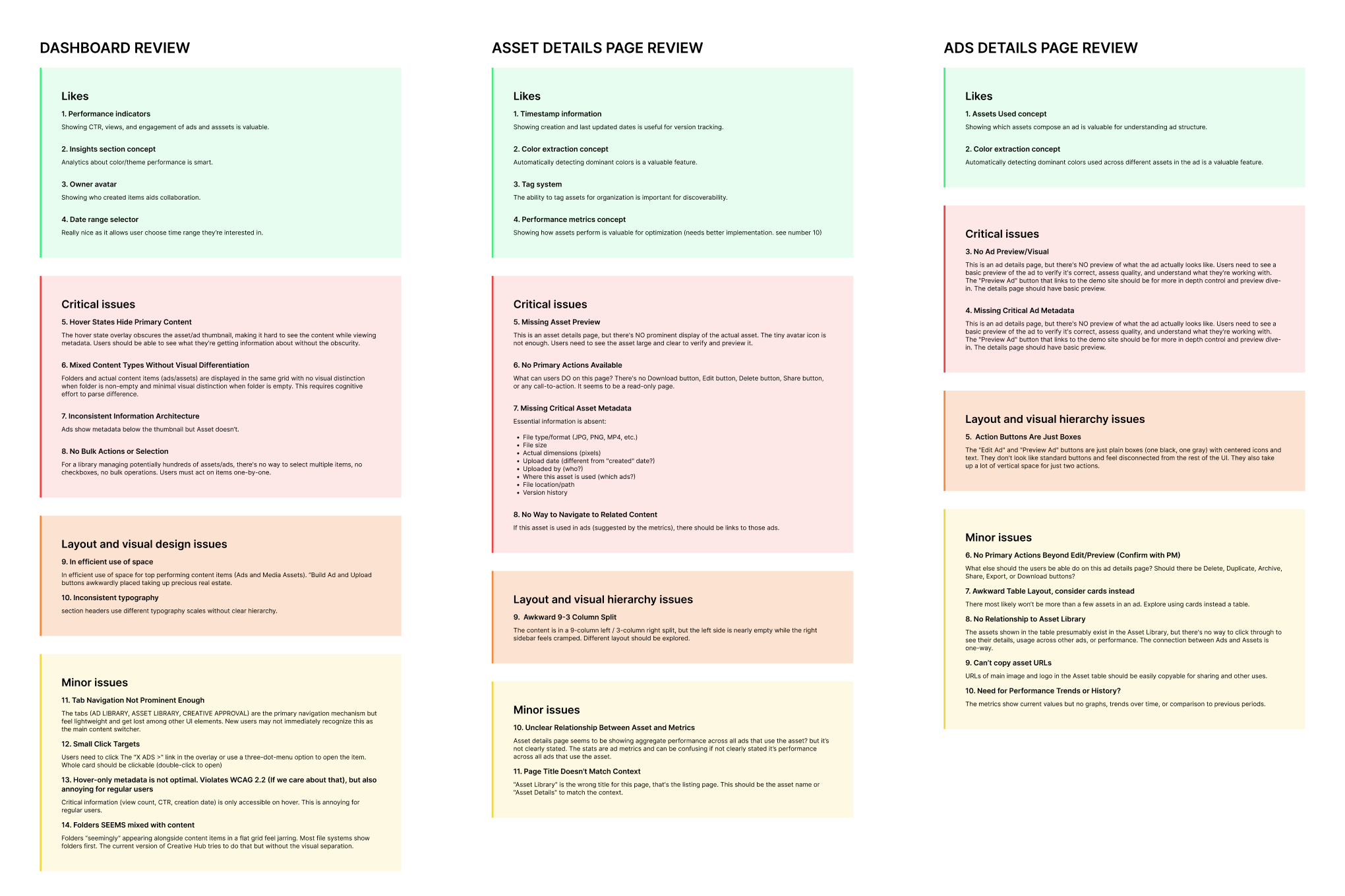
Since Creative Hub already existed as an MVP, I began with a quick UX review of the current experience. I focused on three key areas: the landing page, ad details page, and asset details page. This helped me quickly identify where the experience was breaking down before moving into design.
Across the product, a few consistent problems stood out. The interface made it difficult to distinguish between different content types, key information was hidden behind hover states, and important actions were not clearly surfaced. On the detail pages, the absence of previews and incomplete metadata made it hard for users to understand what they were working with or take meaningful action.
With these insights, I moved into designing solutions, starting with the landing page.
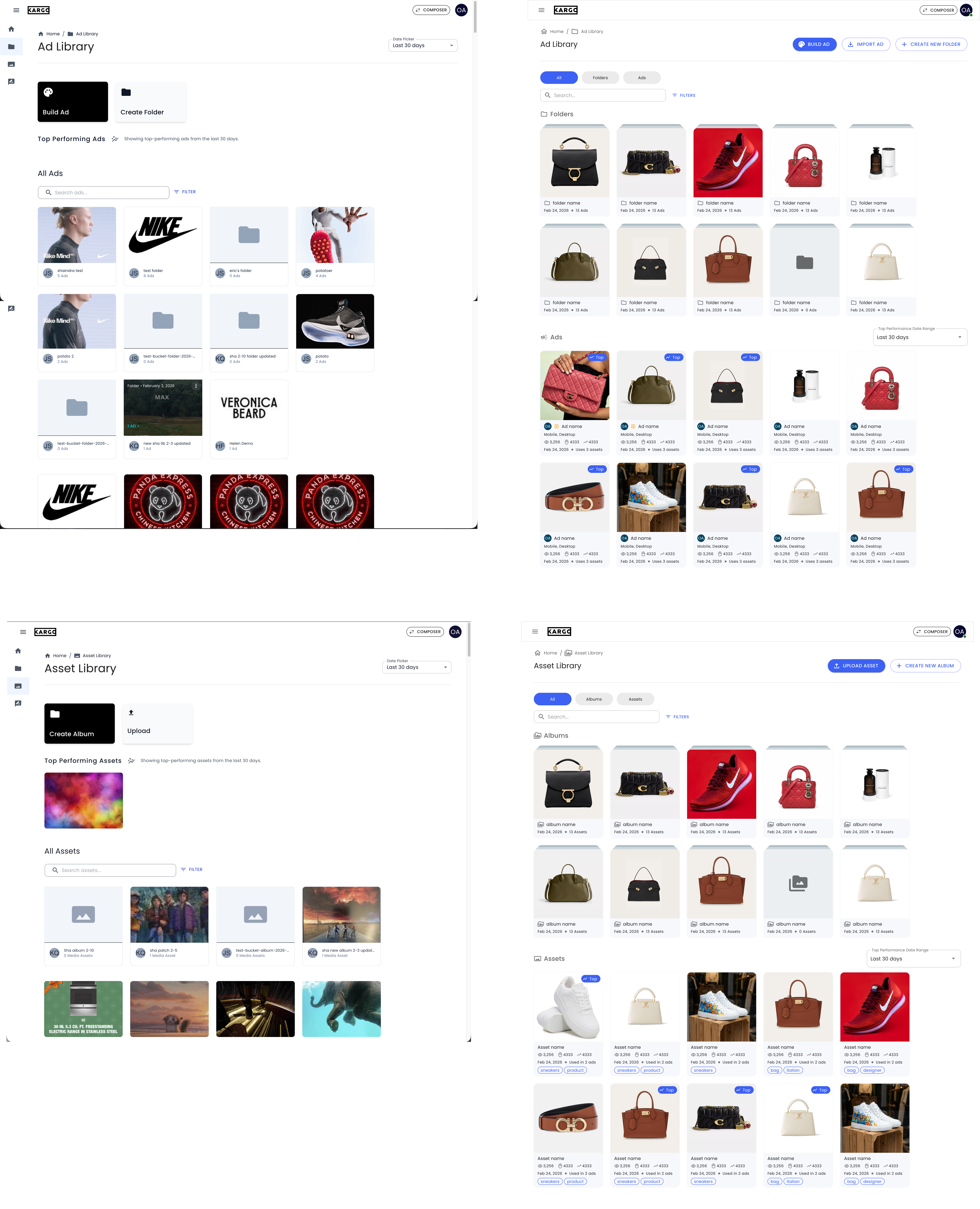
For the landing page, my first iteration focused on structure and clarity. I made entry actions more explicit by expanding them into clear, descriptive cards with visible CTAs. I improved the insights section by introducing visual cues like color swatches and icons, making data easier to interpret. I also restructured the browsing area by separating folders from ads and assets, adding metadata directly onto cards, and enabling actions like selection and folder creation. Overall, this iteration increased information density and reduced the need for unnecessary navigation.
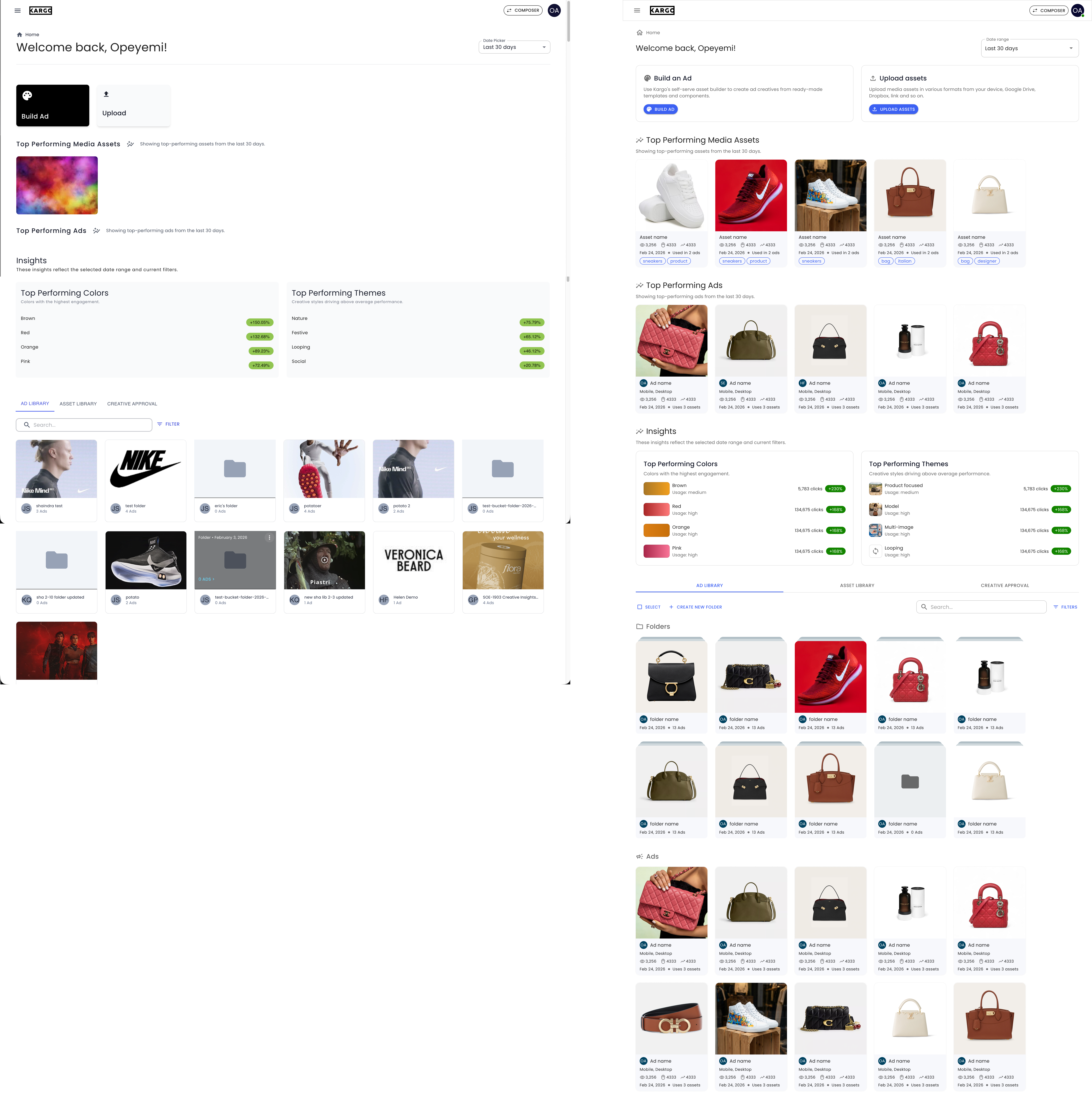
In the second iteration, I simplified the experience further. I removed separate “Top Performing” sections and replaced them with a badge system applied directly to items. This made performance context visible wherever users were working, whether on the landing page, inside folders, or within libraries, while also reducing page length and improving scanability.
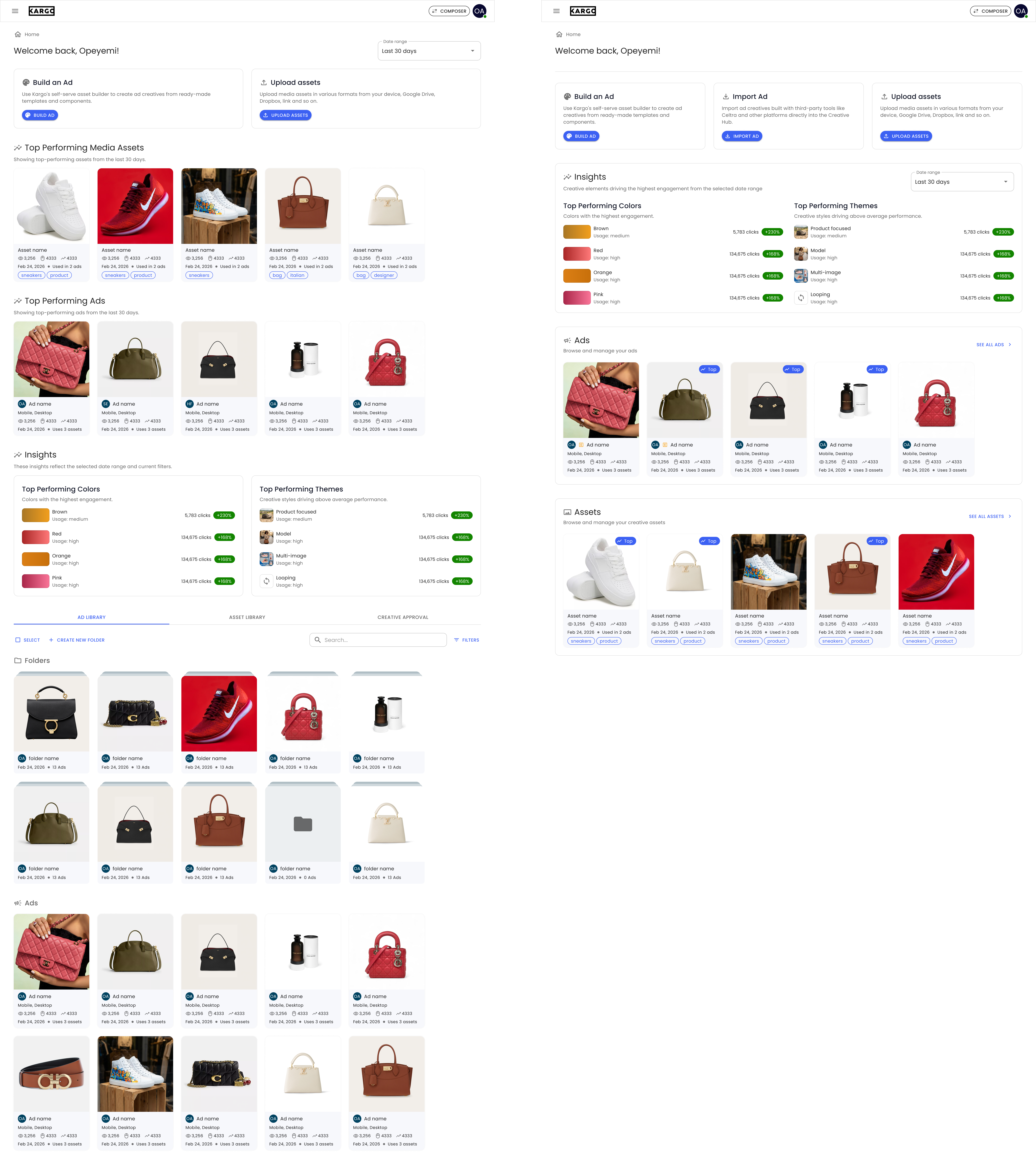
For the ad and asset libraries, I focused on improving organization and navigation. I moved primary actions to the top-right for consistency and accessibility, introduced segmented filters to help users quickly narrow down content, and clearly separated folders from ads and assets into distinct sections. I redesigned the card system to surface important metadata without relying on hover states, making it easier to scan, compare, and act on content.
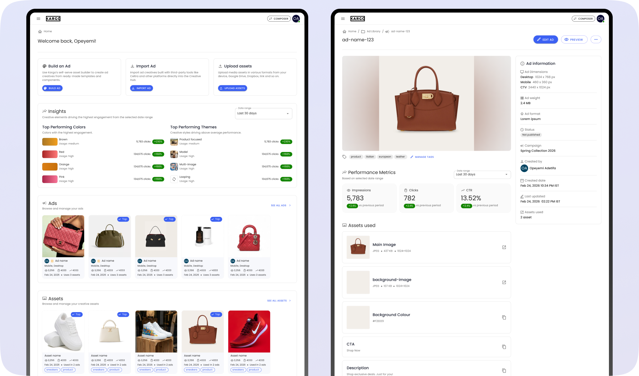
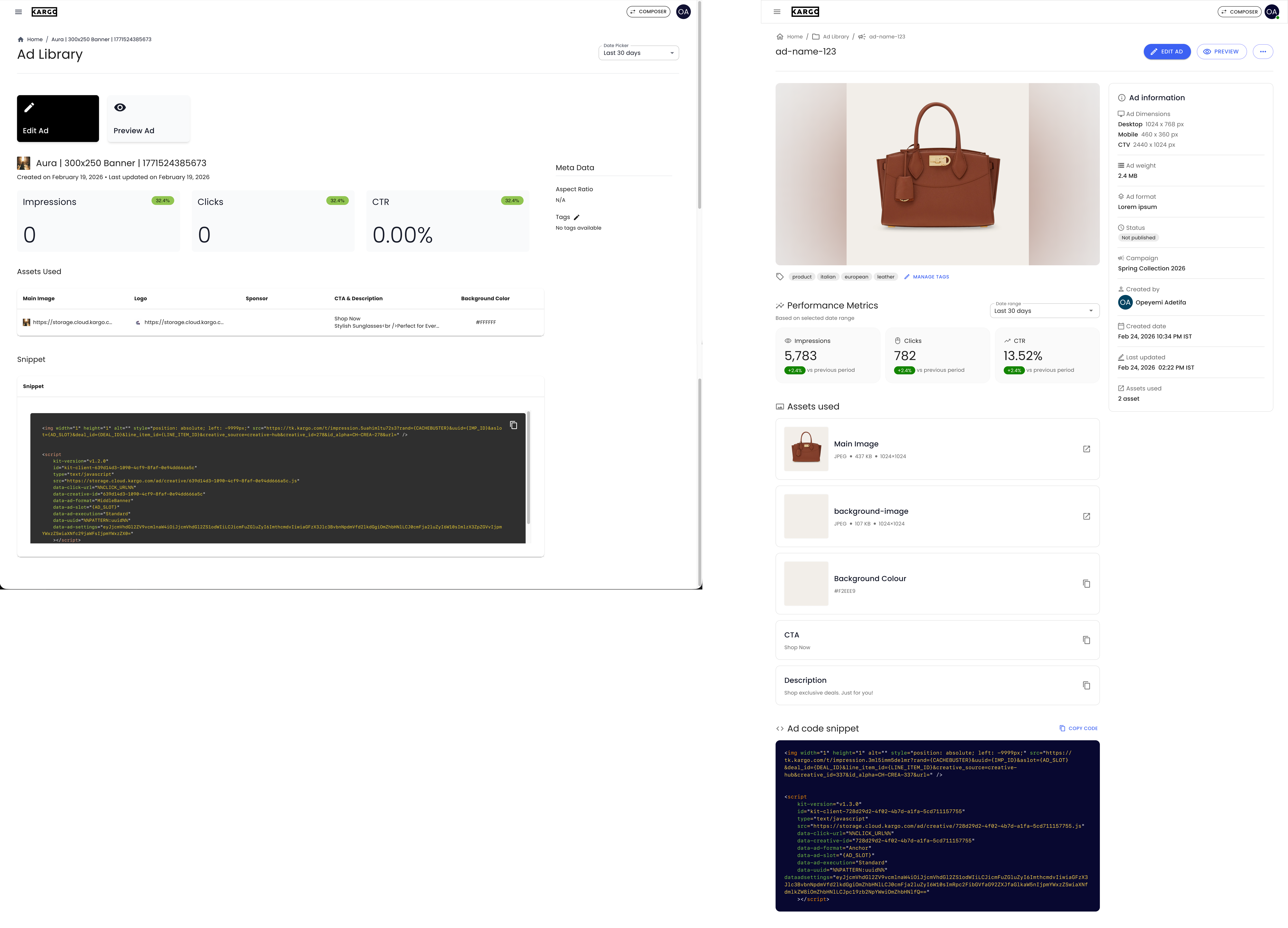
For the ad details page, I redesigned the layout into a structured two-column system. I introduced a prominent ad preview at the top, giving users immediate visual context. I reorganized metadata into a dedicated information panel and repositioned actions into a more standard, compact format. I also replaced dense tables with card-based layouts for assets, improving readability and interaction.
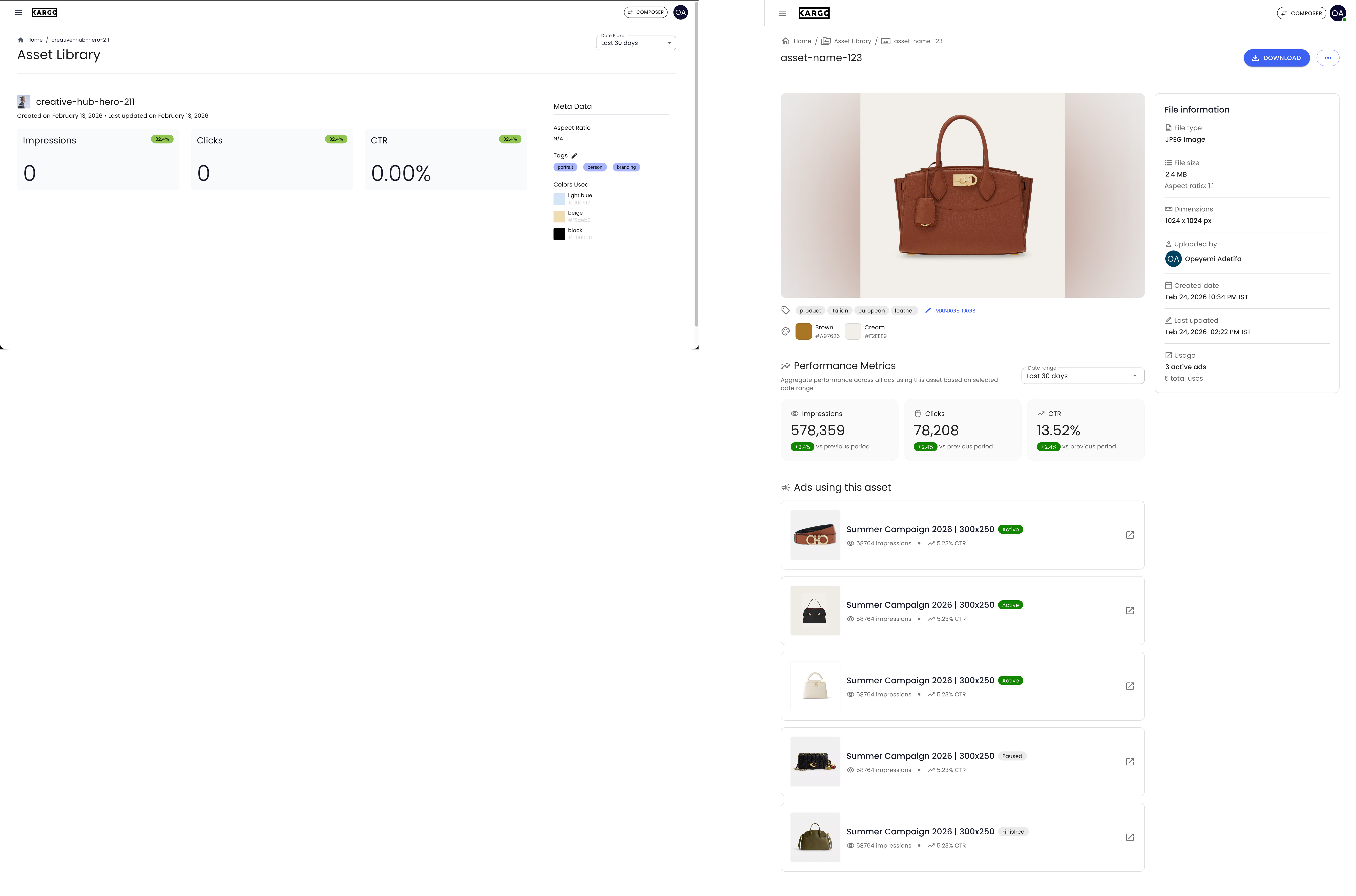
For the asset details page, I applied a similar approach. I added a large preview to make the asset immediately visible, introduced a comprehensive metadata panel, and surfaced tags and color information closer to the asset itself. I also added a section showing where the asset is used, giving users important context and helping them understand dependencies before making changes.
Across all pages, the focus remained consistent: simplify the structure, make content easier to understand at a glance, and ensure users can take action without friction. The final designs moved Creative Hub from a fragmented MVP experience to a more structured and scalable system, where navigation is predictable, content is clearly organized, and key information is always visible.
Reflecting on the impact of this project
The redesign led to strong validation across both perception and behaviour. In a controlled user-preference study, 93% of participants preferred the redesign, and post-launch data showed a 62% reduction in support tickets over two months.
To validate the redesign, I ran a user-preference A/B study comparing the original Creative Hub against the redesigned version. 30 participants were shown both experiences in a randomized order to reduce bias. At the end, half of the participants were shown the original Creative Hub first while the other half were shown the redesign first.
Out of 30 participants, 28 (93%) preferred the redesign. The feedback consistently pointed to clearer structure and layout, easier navigation, and better understanding of content. The redesign reduced the effort required to interpret the interface and made it easier for users to find and act on what they needed.
Beyond user preference, I also looked at real usage data before and after launch. Using data from Zendesk, the platform used for support tickets, we compared Creative Hub-related support tickets from the last 2 months before the redesign launch to the first two months after the redesign launch and there was a drop of 62%. This indicated that users were able to complete tasks more independently, with fewer points of confusion or friction.
These two results together showed that the redesign did more than improve aesthetics, it made the product easier to understand, reduced reliance on support, and improved overall usability for both internal and external users.
To conclude
The redesign of Creative Hub moved the product from a quickly built MVP into a more structured and reliable system that users could actually navigate and use with confidence.
One key takeaway for me from this project was the value of simplifying instead of adding. Many of the improvements came from removing unnecessary sections, reducing duplication, and making information more contextual rather than introducing new information. For example, the shift from a separate “Top Performing” section to embedded top performing badges shows how simplifying structure can improve both usability and scalability.