Clana: Never Forget a Hangout Again
The potential impact of Clana
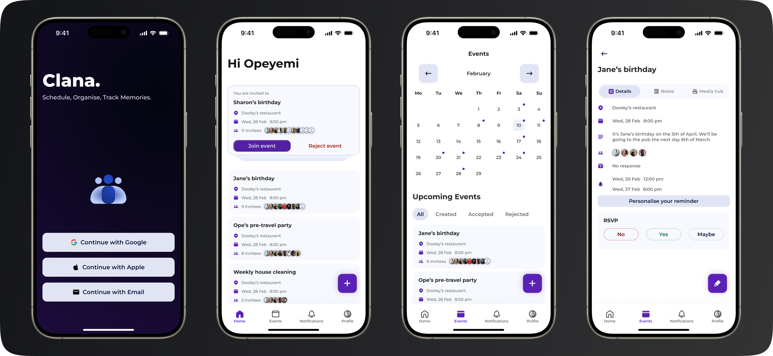
Clana features an event scheduler with customisable reminders, collaborative notes, and shared photo albums. These tools work together to make planning, coordinating, and preserving memories of events a breeze for families, friends, and other social circles.
Clana's potential is immense, making scheduling and organising effortless among family, friends, and other types of social groups. Users can set up an event and invite people with Clana’s event scheduler. With Clana's standout feature, customisable reminders, event creators can strategically set up reminders at times when they will have the most impact, while invitees can also personalise the reminders on their own end to suit their preferences.
Another way Clana is so powerful is that it allows users to create notes and to-do lists within an event which significantly helps social groups coordinate before and after events. In addition, event participants can create albums and upload memories of the event. These features were carefully and thoughtfully crafted to make planning, scheduling and sharing memories very easy among social groups.
The brain and brawn of Clana
Clana showcases my comprehensive learning journey in my M.Sc. programme. I was responsible for all aspects of the project, from design to development to deployment.
Clana is the capstone project for my MSc in Creative Digital Media & UX program. This project encapsulates the comprehensive learning journey, focusing on identifying and addressing a design challenge, understanding its domain and users, and crafting a user-friendly solution.
As an individual project, I am responsible for everything from every design phase to every development stage, up until deployment in the Play Store and App Store. This significant personal undertaking demonstrates my capability in problem-solving, designing solutions, development, managing project timelines and deadlines, and product management.
The Clana backstory
How wanting to help a family member manage and coordinate better gave birth to Clana.
The idea for Clana originated from a conversation with a family member who expressed the desire to be better informed about family happenings and easily remember upcoming events. They also wanted a way to effortlessly share pictures of memories among the family.
I asked them if apps like WhatsApp and photo sharing apps like Google photos could not solve this problem. They expressed that important information always gets lost on the family WhatsApp group chat and Google photos’ way of sharing pictures with people is complex especially for older and less tech savvy family members. The idea of a single app to handle all these tasks emerged. I envisioned an app where users could create a family group, organise, plan, and schedule events, and easily share pictures of wonderful memories. When the time came to choose an idea for my final MSc project, working on this concept was an easy decision.
The first wireframes and low fidelity prototype
I began by focusing on the pain points and brainstorming features for a family collaboration app, then moved straight to digital wireframing in Figma to visualise these ideas.
I wanted an app where users could sign up, create a family group, add members, and collaborate. Any member could create events, notes, to-do lists, albums, and upload photos, with everything accessible to all group members.
I immediately started digital wireframing to help me visualise these ideas. Ideally, I would start with low-fidelity sketches using paper and pencil. However, digital tools like Figma have improved to the point where I can iterate on low-fidelity mockups more quickly, making it practical to start with it.
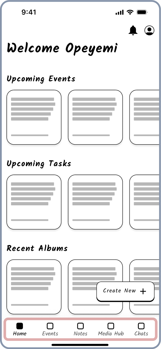
The first wireframe had five main tabs in the bottom navigation: Home, Events, Notes, Media Hub, and Chats. The Home screen layout was structured into distinct sections displaying summaries of key information, such as Upcoming Events, Upcoming Tasks, and Recent Albums.
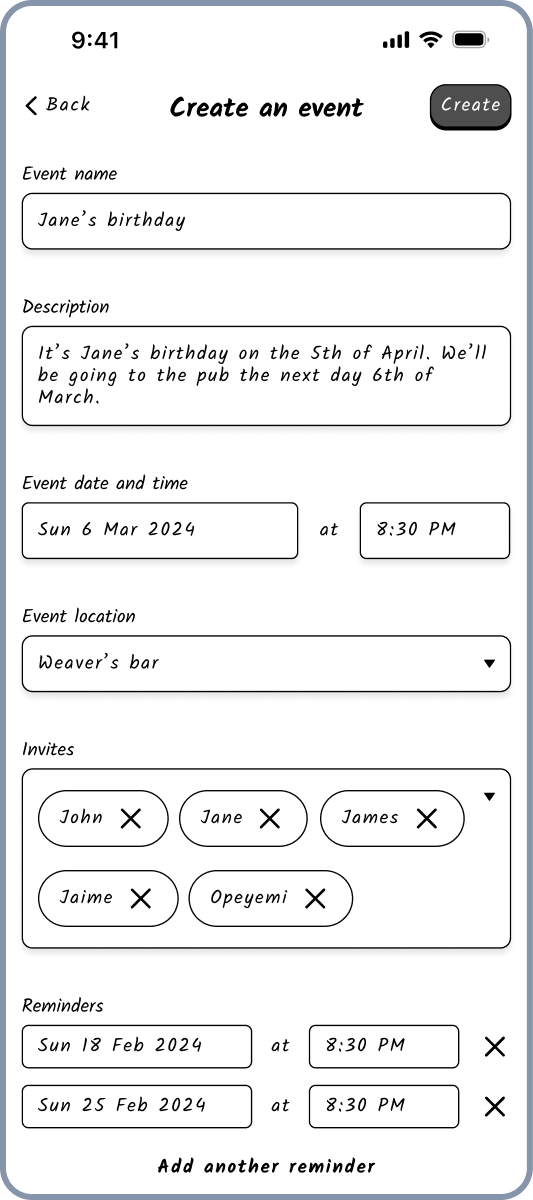
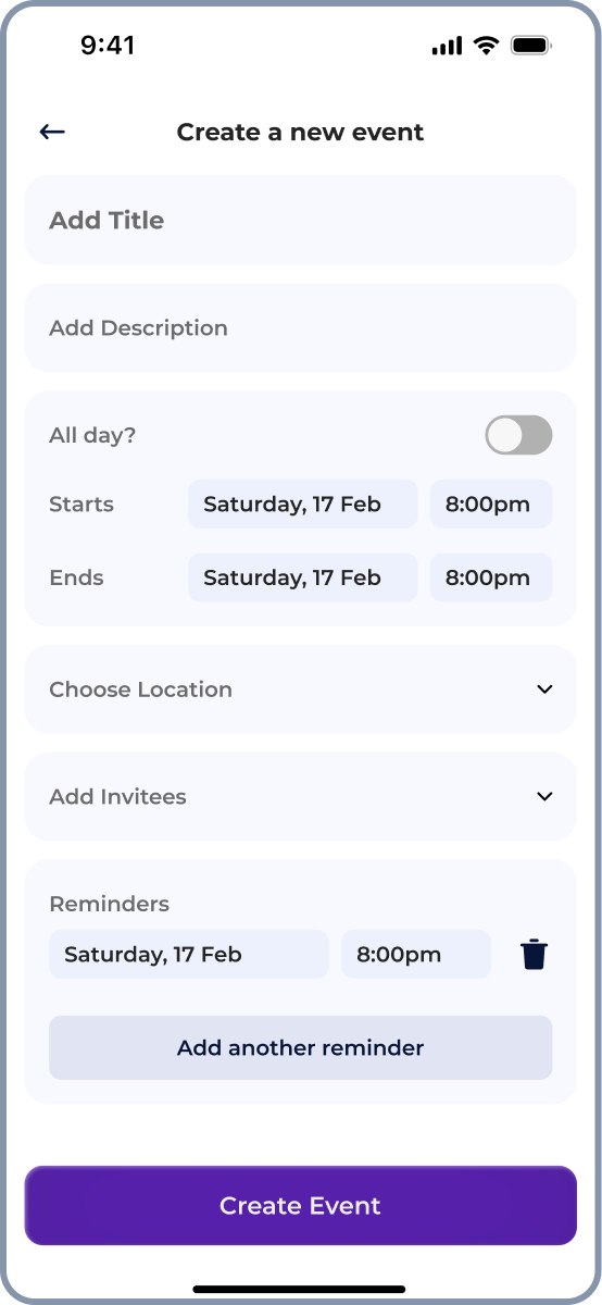
Wireframes were created for three main features: event creation and shared calendar, notes, and the media hub. The event creation layout was structured into sections like Event Name, Description, Date and Time, Location, Invites, and Reminders making it easy for users to understand the content.
The events screen featured a calendar at the top and a list of upcoming events below, each list card containing details about the event. The list format allow users to quickly browse and navigate through the events list.

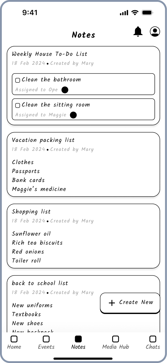
Notes section used cards to represent different notes or to-do lists.
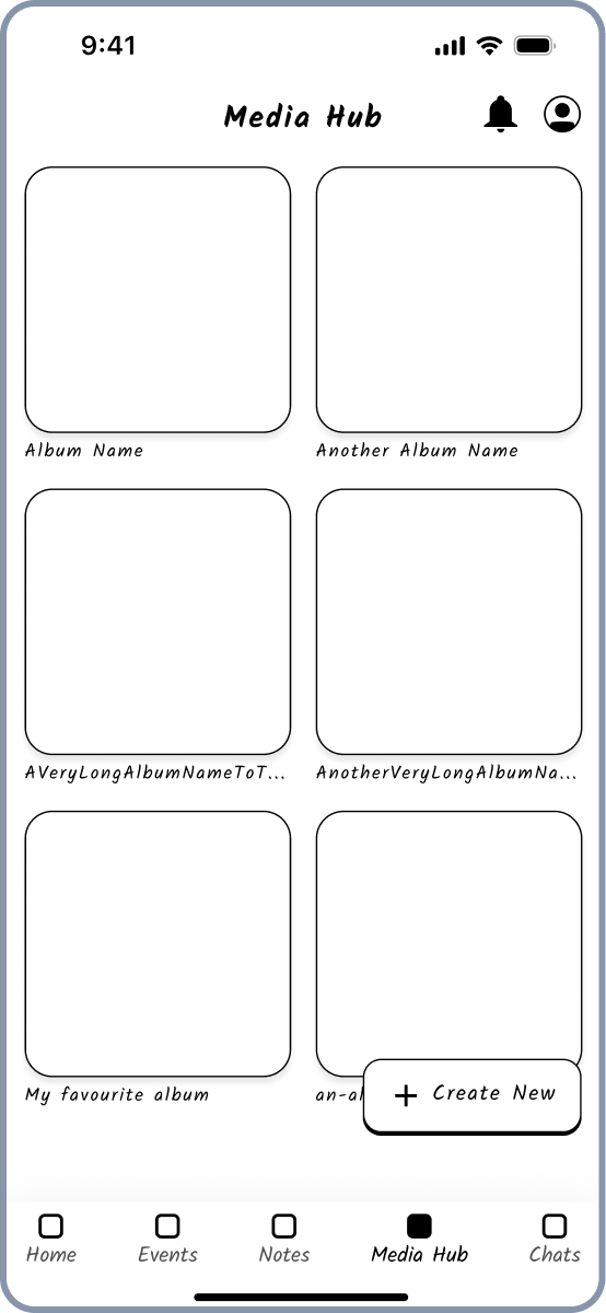
The media hub layout utilised a grid format, with each album represented by a square card with the title underneath. This grid layout is effective for visual content, allowing users to quickly scan and identify albums.
Testing the prototype
User testing revealed the need to expand the app's scope beyond families to include various social groups. Feedback also indicated low interest in the chat feature, as users preferred existing communication apps like WhatsApp.
After creating the initial wireframes, I developed a low-fidelity prototype to gather early feedback. The first prototype tested the flow of creating an event and inviting group members to the event. With this functionality, users can create an event and invite members of their clan.
Here’s a video of the prototype of this flow.

User testing revealed that the app needed to broaden its focus from just families to any kind of social group needing to collaborate, schedule, or plan together. Another takeaway was the low interest in the chat feature, as users already have established communication methods with people using apps like WhatsApp.
Early research on the validity of Clana
The research findings from the qualitative interviews and the quantitative survey validated the insight from the usability tests that there is a need for an hybrid platform that addresses issues like forgetfulness and inefficient coordination across various social groups.
Based on the usability test insights, I conducted research to validate the idea of broadening Clana's focus from families to social groups in general. The research included qualitative interviews to uncover user needs and challenges and a quantitative survey to validate findings across a broader population. The main aim was to investigate and understand user behaviours, needs, frustrations, and values regarding event organisation, schedule coordination, and memory sharing among all their social groups.
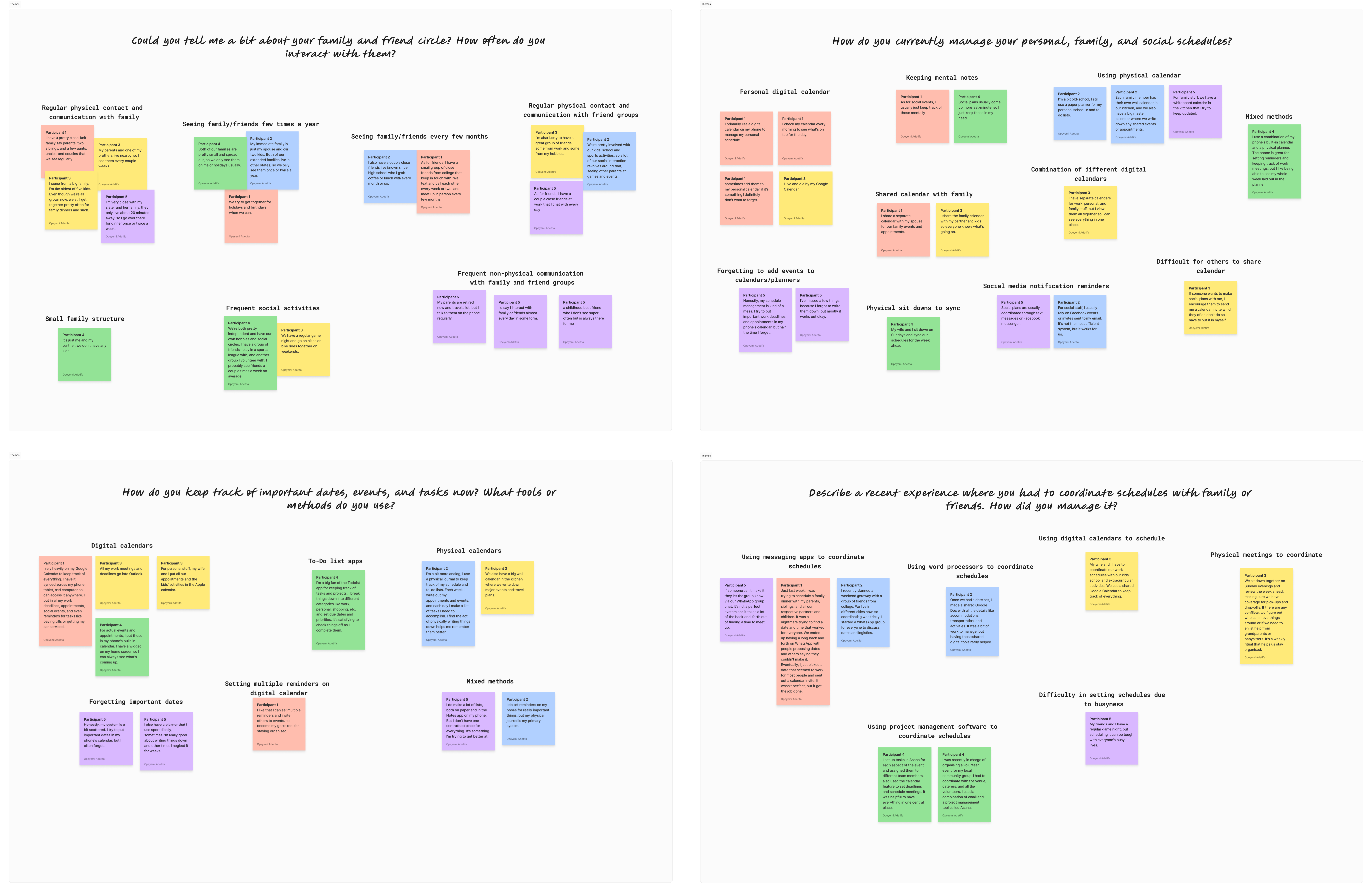
Here are some key insights I derived from the themes that emerged after the affinity mapping of the qualitative data:
- The need for a hybrid platform consolidating calendars, schedules, to-do lists, and memory sharing in one place.
- Addressing forgetfulness in task and event management through features like multiple reminders and shared task lists.
- Challenges in sharing and preserving memories, with a need for simplifying the process of sharing, organising, and preserving memories.
- Effective schedule coordination tools, including shared calendars and reminders.
- A user-friendly interface that is easy to navigate.
- Privacy and security concerns, with robust measures to protect sensitive data.
- Integration with existing digital tools like Google Calendar, Todoist, and online drives.
Here are some key insights I derived from the results of the quantitative research (survey):
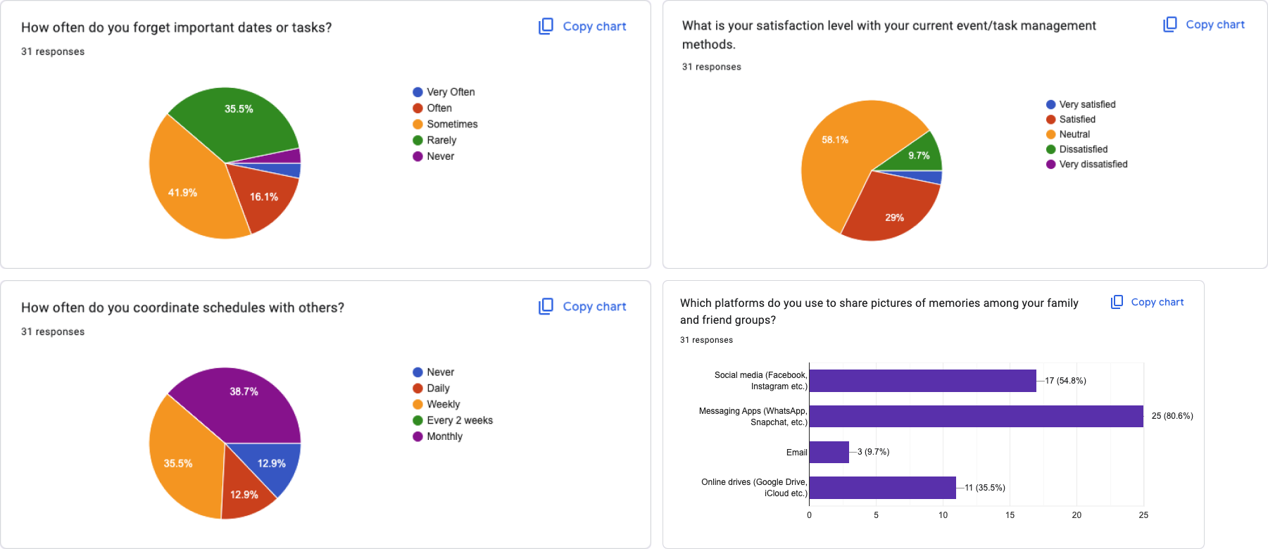
- The majority of respondents (80.6%) use messaging apps like WhatsApp and Snapchat to share pictures of memories among family and friends. These messaging apps are not designing specifically for sharing memory and organisation which indicates the need for a more streamline organised and efficient way of sharing pictures of memories with family and friends.
- Respondents coordinate schedules with different social groups with varying frequency, with monthly (38.7%) and weekly (35.5%) coordination being the most common, indicating the app should provide a way to coordinate with different social groups and also streamline scheduling regardless of social group and frequency.
- A significant portion of respondents (41.9%) sometimes forget important events or tasks, highlighting the need for effective reminders and organisation features.
- More than half of the respondents (58.1%) feel neutral about their current event/task management methods, suggesting an opportunity for a more satisfactory and efficient solution.
- While most respondents (51.6%) are satisfied with their current memory-sharing methods, there is still room for improvement, with the app focusing on enhancing user experience and providing additional value.
- The majority of respondents (67.7%) feel neutral about the ease of their current scheduling methods, indicating an opportunity to simplify and improve the scheduling process.
Continuing to refine the prototype: The second low fidelity prototype
I iterated on the app's wireframes based on initial feedback, to accommodate various social groups and enable users to create and join multiple groups.
Using the knowledge from the first prototype and the research validation that the app needs to cater to not just families but to any kind of social group. I continued iterating on the wireframes. I removed the "Chat" tab in the bottom navigation and replaced it with "Clans" (a branded term for groups on the Clana app), aligning with the feedback that users want to be in multiple groups simultaneously.

I conducted another round of testing with the new iteration of the low-fidelity prototype. This prototype tested the flow of creating a notes and assigning it to a member of a group. With this functionality, users can create a note or to-do list in the planning of an event and assign that to another member of the group (clan). They could also set a deadline for the task to reminded the assignee.
Here’s a video of a prototype of the flow.

The test yielded generally positive responses. I then moved to the creation of high-fidelity mockups and prototypes.
Designing the next level: The first high-fidelity prototype
The high-fidelity mockups and prototype for the app feature a clean, minimalist interface, targeting both iOS and Android platforms to ensure wide accessibility.
The first iteration of the high-fidelity mockups and prototype was designed to satisfy the user values of a simplified interface and user-friendly design. The interface is clean and minimalist, with a structured and organised layout ensuring easy navigation. The high-fidelity mockup/prototype targets both iOS and Android platforms, ensuring a seamless and consistent user experience across the two most widely used mobile operating systems. This decision maximises the app's reach and accessibility, allowing users to stay connected and organised with their family and friends regardless of their chosen device.
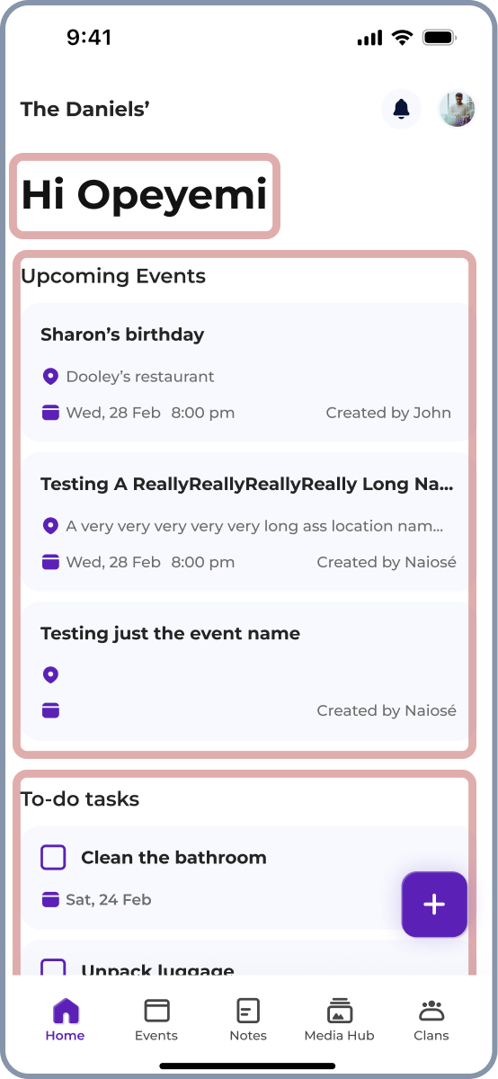
The UI features a bottom navigation bar with icons for Home, Events, Notes, Media Hub, and Clans, providing easy access to different app sections. The top navigation bar displays the family or group name and allows users to access notifications and their profile.
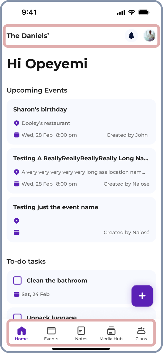
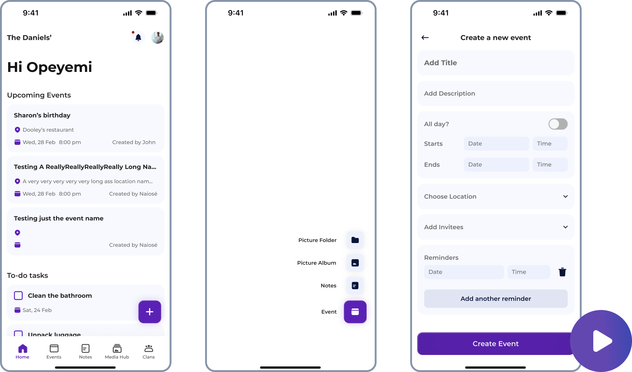
The home screen features a personalised greeting, upcoming events, to-do tasks, and albums sections.
The events screen includes a calendar and upcoming events list.

The event creation flow is well-structured with clear sections for event details.
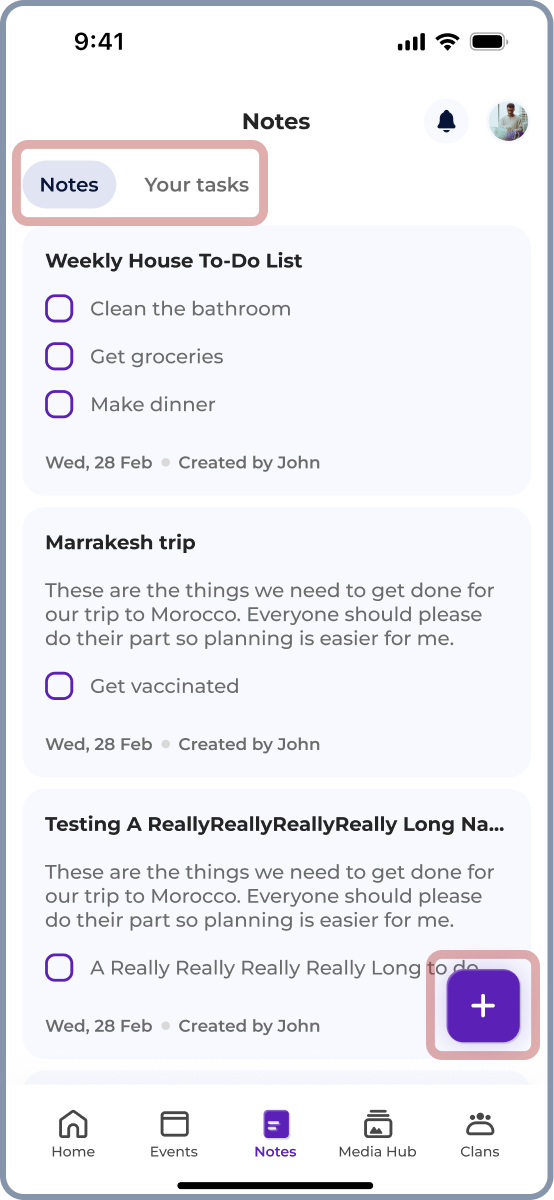
The notes screen features chips for filtering between notes and tasks, with a floating action button for easy note creation.
The media hub screen showcases photo albums and folders.

The clans screen lists various groups the user is part of.

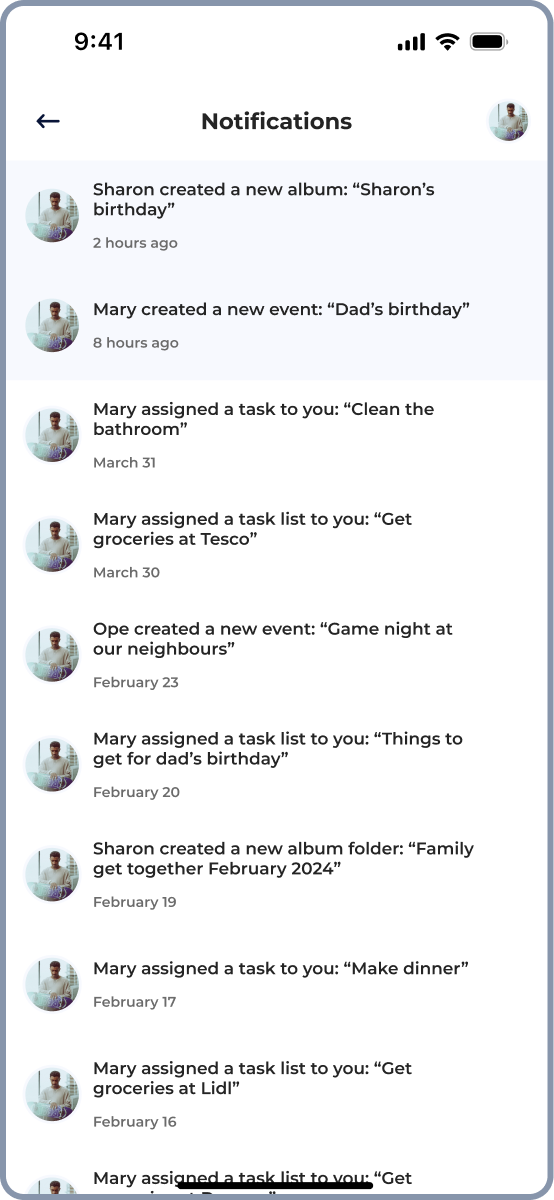
The notifications screen lists updates chronologically.
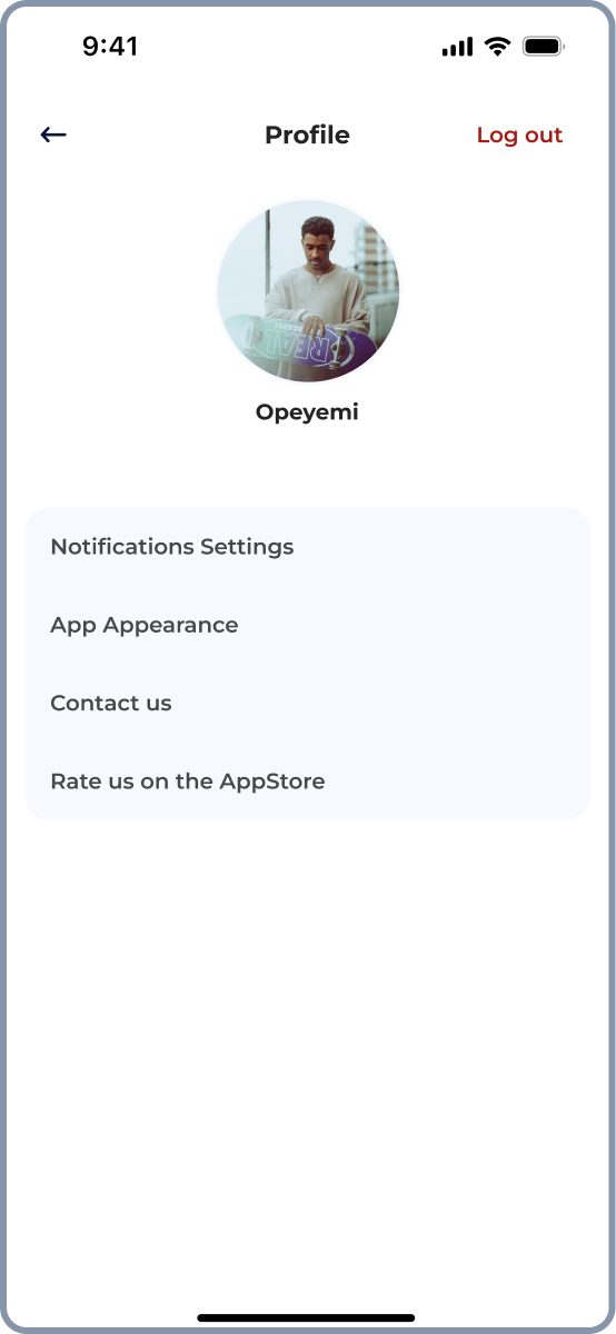
The profile screen displays the user's profile picture, name, and settings options.
The high fidelity prototype handles two key user flows, the event creation flow, which is a key use case, and the note creation flow, another key use case. With the event creation functionality, users can create an event, invite members of their clan and set multiple customised reminders. With the note creation functionality, users can create notes and to-do list and assign them to any member of their clan.
Here’s the high-fidelity prototype.
Changing the app’s model due to technical difficulties and crafting the final look
Due to backend complexity, I shifted the app from a group-based model to an individual-focused model but this also resulted in a more streamlined user experience. This change led to a redesigned UI with simplified tabs and event-specific collaboration features.
While considering the app's development, I realised the complexity of structuring the app’s database for a group-based model where a user will be able to be in multiple groups simultaneously. I decided to change the approach to an individual-focused model, where each user's account is independent and not part of any group by default.
In this new approach, event creation is done by individual users who can invite people of their choosing to the event via email.
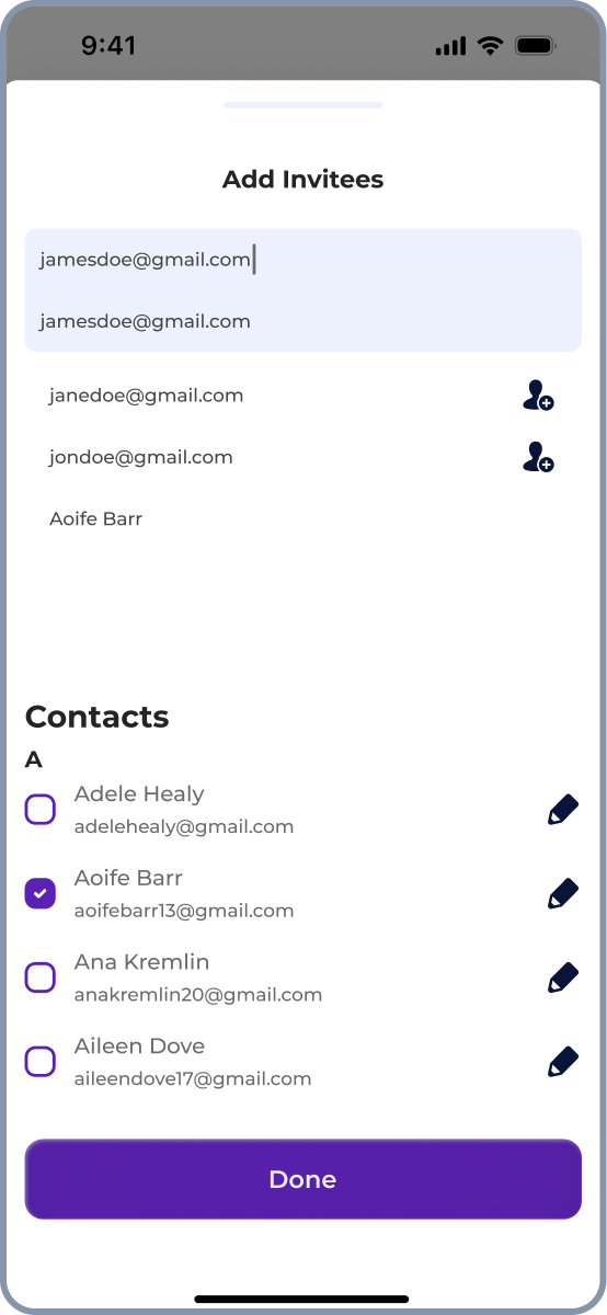
Each event is self-contained and can only be accessed by invited participants, ensuring privacy and relevance. Within each event, there are dedicated sections for notes/tasks, and photos related to that specific event, keeping event-related content organised and targeted.

When users open the app, they only see their own account with upcoming events they created or were invited to, eliminating the need to navigate through different groups to find relevant events.
This pivot in approach, although arising from technical difficulties, provides a more focused, privacy-conscious, and streamlined experience. Users have more control over the events they create and participate in, without being overwhelmed by irrelevant group content.
The new approach still retains the collaborative features from the group model but refines them for a better experience. The siloed nature allows for targeted sharing and collaboration within specific events while maintaining an overall sense of individual ownership and organisation. The app becomes more user-centric and oriented around each person's schedule and priorities.
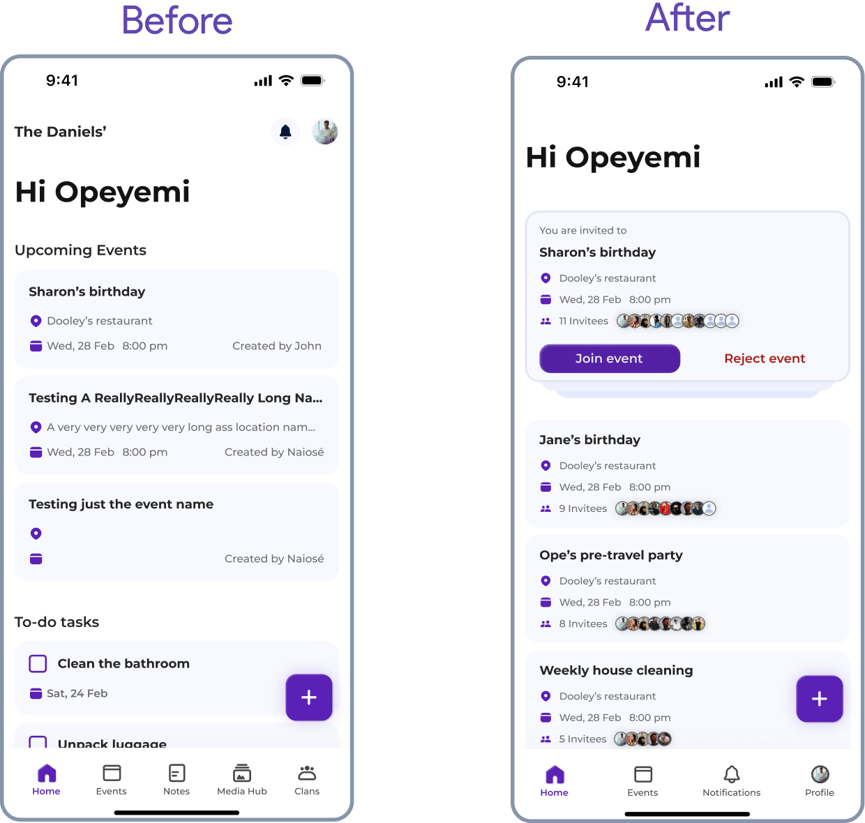
On the new UI. The tabs have changed from [Home, Events, Notes, Media Hub and Clans] to [Home, Events, Notifications and Profile].
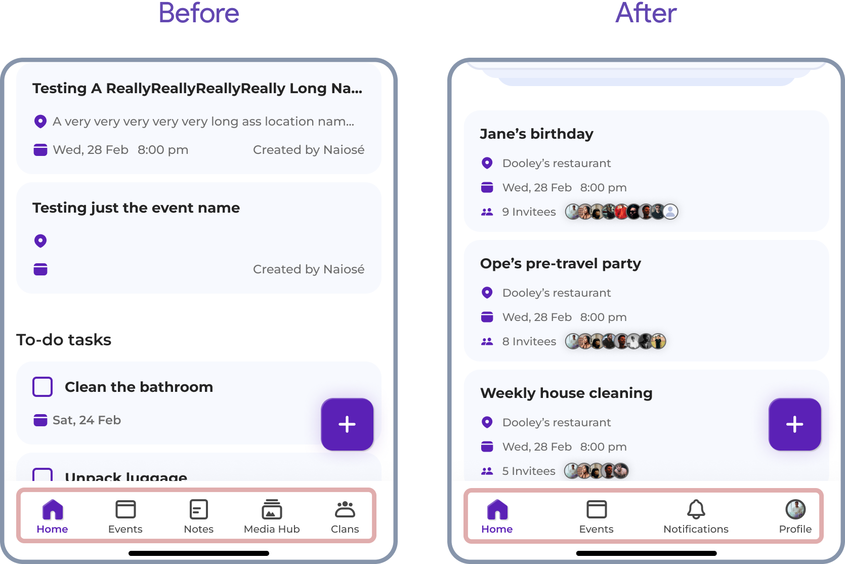
The home screen no longer features the group name and now lists the individual user's upcoming events. At the top of the home screen, a stacked card displays the events the user has been invited to, allowing them to join or reject the events directly.
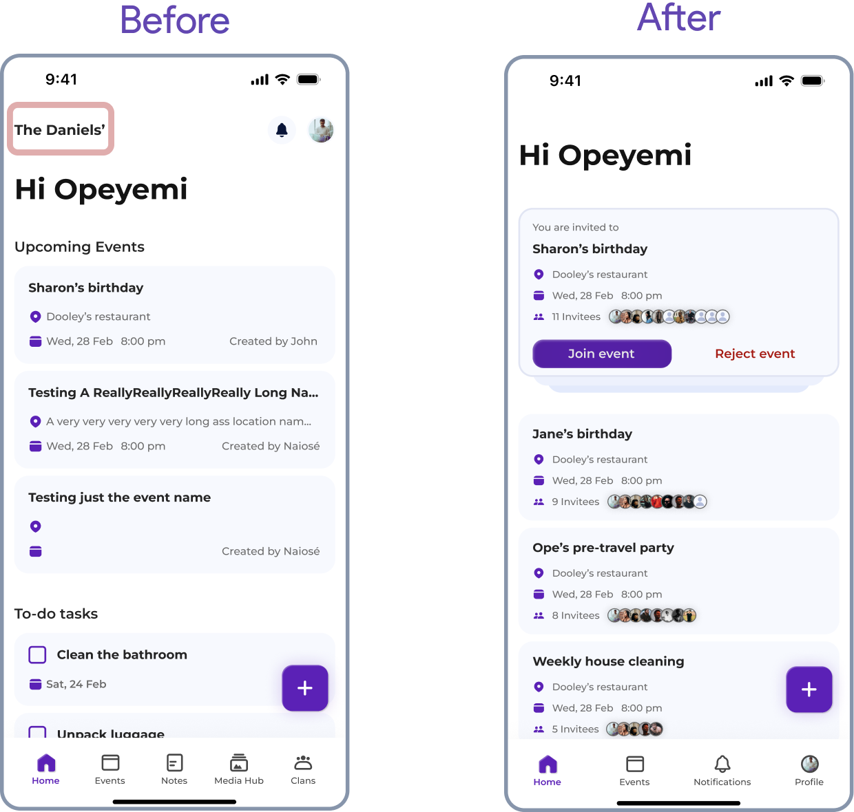
The notes and media hub functionalities have been moved into events, and collaboration is now only possible within events and not at a group level as was previously the case, keeping the user experience more organised, streamlined, and relevant to the events they're attending. This contrasts with the previous group model, where users would be inundated with every note, album, or photo uploaded, regardless of its relevance to them.

The final high-fidelity prototype covers two key flows: users can create an event and invite people, and they can also accept invites to join events.

Accessibility considerations
The app will prioritise accessibility by adapting to users' device text settings and supporting screen readers, ensuring visually impaired individuals can navigate with ease.
The app will adhere to and follow the native device text sizing in the Display settings of users' phones, catering to users with low vision by allowing them to use the app in their preferred font size. The app will be fully compatible with screen readers such as VoiceOver for iOS and TalkBack for Android, ensuring that visually impaired users can navigate the app using auditory feedback.
Interactive elements such as buttons and links will have large touch targets (at least 9 mm by 9 mm) to accommodate users with motor impairments. Given that older adults, who are part of the target audience, may have varying levels of technological proficiency, the app will also feature a user-friendly design with clear, simple navigation and easily recognisable icons.
My reflections on this project and next steps
Working on both design and development showed me that successful projects rely equally on good design ideas and solid technical planning, while staying flexible enough to make big changes when needed.
Throughout my UX career, I have always acknowledged the importance of early collaboration with engineering. Being in charge of both the design and development of this project, which requires significant backend engineering and database expertise, has given me an even finer perspective on design and engineering collaboration.
As much as design drives the development of a product, engineering and discussions about technical feasibility, are equally important.
Another point to mention is the willingness to pivot and refine an idea. During this project, I had to change a major part of how Clana works. Having an open mind and being receptive to feedback was crucial in my ability to easily pivot and find a solution to the backend complexity.
The app has been built. I developed it using React Native and Expo with TypeScript, and Firebase for the backend. Here's a demo showing the app in action.
